What we get others to see subconsciously influences what they do. Design has the power to influence people’s moods and win their hearts. Being familiar with design trends and using them in the desired manner will pave the way for the success of your business.
What’s a Trend? And Does It Appear out of the Blue?
A trend or a long-lived fad is a tendency toward a particular style, be it in fashion, design, entertainment, or other aspects. Trends are different from short-lived fads that lose their way very soon. Memes, viral videos, catchphrases, and design trends are all examples of trends that never appear all of a sudden. They are triggered by specific events and evolve as a result of social influences that cause a shift in styles and preferences. The context in which a trend develops is very critical.
What Are the Advantages of Being Familiar with Design Trends?

Well, being familiar with design trends and knowing how to use each one properly will make you stand out in the digital world. And in this article, we aim to introduce five design trends using one specific model, Pinocchio, to help you understand them better.
Doodle Design Trend
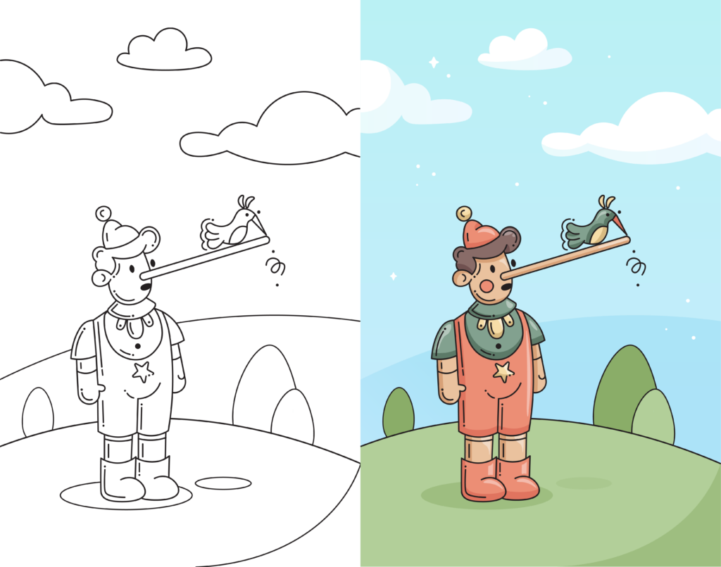
We’ve all doodled at some point in our lives. All the sketches that we used to draw absent-mindedly while the teacher was teaching or while we were talking on the phone were doodles. So can we say doodling is simply sketching what comes to mind? Yes. In fact, doodling is a door for everyone to enter the world of art. It can be a tool for concentration. The effect that doodling has on the mind is more valuable than the result on the paper. It helps relieve the mind.
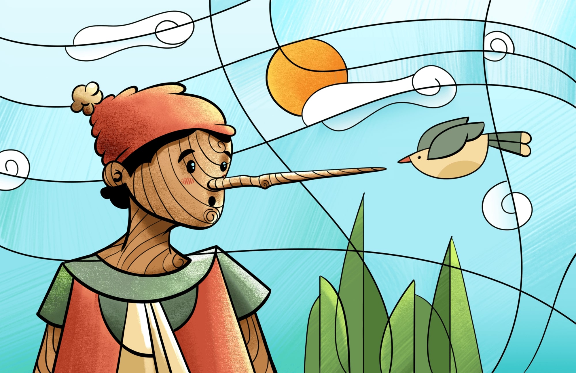
How about this doodled Pinocchio? It doesn’t seem to be an absent-minded drawing, right? Let’s consider it from another angle. Do you know what doodle actually means? Its origin goes back to the 17th century, and it signifies a foolish or a dump person, and this photo represents an unreal foolish person. But it’s not all; the nature of the drawing is also making this illustration a doodle owing to the usage of black lines, unreal proportions, and scribbles. Normally, doodles are not colored, but for the sake of consistency in this article, we have colored this doodle.
Interestingly, creating doodles has become a sought-after hobby for every designer since Google has been employing them as their emblem to reflect every distinct event.
Doodles have many uses, including but not limited to: packaging design, logo design, UI of websites and apps, and pitch decks.
Flat Design Trend
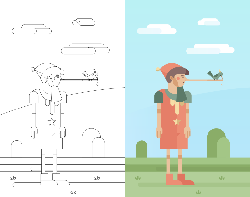
Do you know what IBM’s favorite style is? Flat Design. This design style has long been pushed into the mainstream of design and has an established place in this industry. This is the most effective design style for improving user interface usability and aesthetic harmony.
Flat design is easy to recognize. It is a design that lacks dimensions, depth, shadow, textures, or rich color palettes. It also has straight lines, bright colors, and 2D drawings. In fact, the design is entirely flat and lacks any details. As the dictionary definition implies, flat means on one level. So, a flat 2D drawing is one that is simple and has few details. It is the opposite of a design that is rich or realistic. As a result, this design focuses less on details or distracting the viewer and more on getting the message across quickly and efficiently.
Since this trend aims to solve problems, designers sometimes enlarge important elements to convey the message easily. For example, to show internet payment, an artist can draw a large mobile phone in front of which a small person is standing and using the phone to pay.
Flat designs are versatile because they are easy to understand, resulting in a pleasant user experience. We can use flat designs to create icon sets, unique typography, mascots, illustrations, logos, UI interactions, infographics, social media graphics, digital advertisements, and so on.
Cubism Design Trend
Do you know how Cubism originated? It all started in the early twentieth century when everything was changing, and the world was heading toward industrialism. A group of artists began to criticize the more realistic illustrations. They argued why they should replicate reality when there is a camera. So, what did they do? They made the first total break with realism and aimed to transform the meaning of art by using fragmented, angular, geometric, and exaggerated forms instead of mimicking reality. As a result, this design trend is modernism’s greatest leap. They believed that paintings should include objects. And they were less concerned with creating a story and more focused on showing multiple perspectives in one picture.
This abstract geometric style which has to do with presenting visual information from many angles simultaneously, has become very popular in this digital art. It is mostly used in graphic design applications, logos, posters, and media illustrations, among many others.
Freehand Design Trend
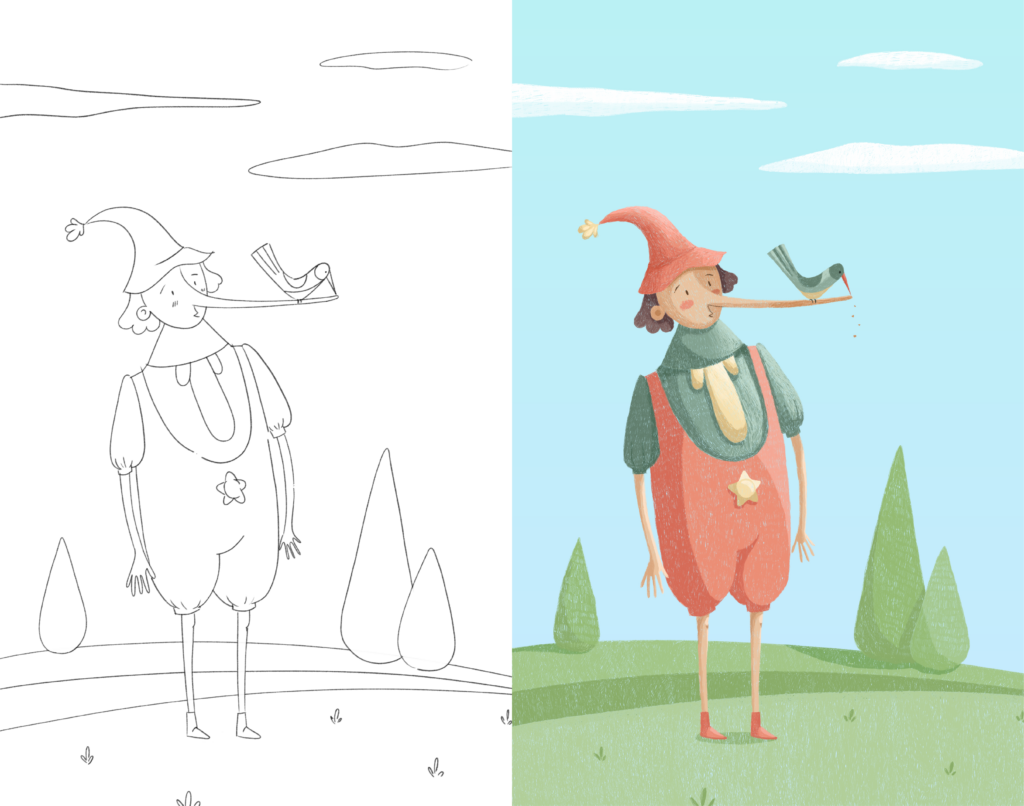
You’ve probably all used colored pencils before. Just think back to elementary school and those boxes of colored pencils. How did you feel while using them?
To paint freehand, you need nothing more than a piece of paper, pencils, an eraser, and your hands. There are various types of freehand, but we will concentrate on digital colored pencils because of their popularity and because, in the digital world, you have access to a color palette with millions of different colors.
What features does this design trend have? Color change separates different parts of the illustration. Hand movement has an effect on the illustration, making it unique to you. There are no restrictions on what you can illustrate. By controlling the pressure of the pencil, you can control cross-hatching, create a unique texture, or add dimension to your work. Most of us enjoy this style because of the expressiveness and freedom it allows us to achieve.
This illustration has minimal contrast and no outline. The artist’s imagination and creativity have given way to this work of art.
This trend in graphic design is extensively used in hard copy illustrations such as books.
Comic Design Trend
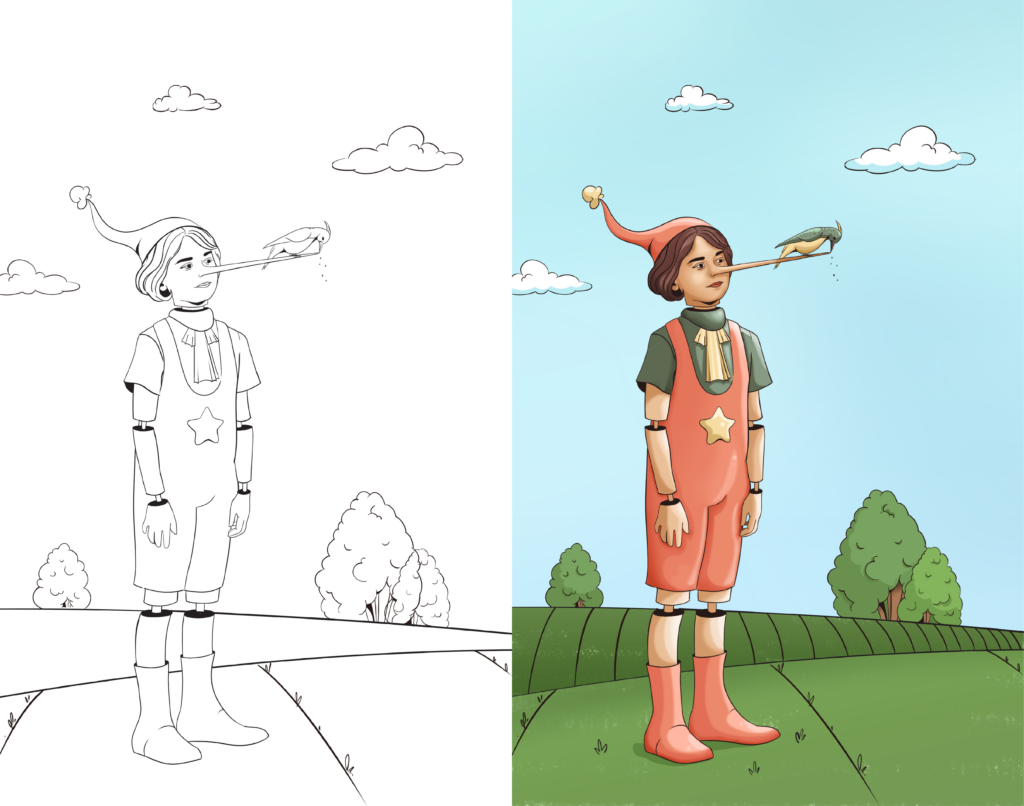
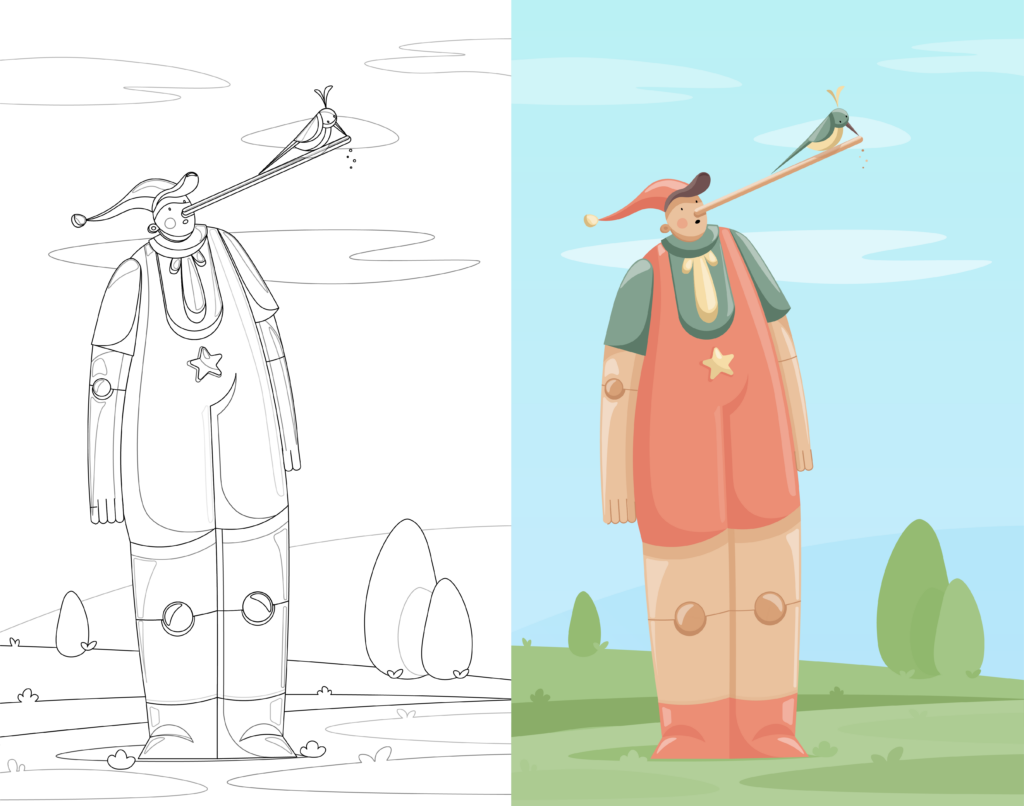
The comic design style is a type of surrealism in which the elements are blended in an unusual way, going beyond what is normal and transforming them into something extraordinary. The artist can exaggerate some elements while keeping realistic proportions. For example, in this design, parts of the body are given the appearance of a robot. This style incorporates bright and saturated colors, dark outlines, thick dark lines, shadows, and other elements.
So, what characteristics does this trend style have? High contrast, an enormous number of colors, the use of outline colors that are darker than the other colors in the illustration, and the proportion and size of the illustration are more realistic; there is no need for exaggeration.
Comic style art is a powerful communication tool. The narrative storytelling and imagery that comes with it can increase empathy with viewers. It can be used in the user interface design of many fields like healthcare, education, and so on.
Conclusion
In this article, we reviewed five different trends, along with illustrations that were designed with a pinch of inspiration and creativity. This practice broadens the mind. Also, it helps you know when to use one design over the other because every illustration and design trend undoubtedly evokes a different feeling.
Do you want to see the 3D illustrations of these designs? Don’t miss a second. They’re way more gorgeous!!
Stay tuned; more is on the way!
And don’t forget to check out our previous article.
