How Important Is Packaging Design for a New Product?
There is little doubt that packaging design, especially for skincare products, has a significant impact on people’s buying decisions. It can attract or frustrate customers at first glance. Special Packaging design for a new skincare product that can make people stumble upon its simply beautiful design is definitely every business owner’s dream. Why? Because beauty attracts everyone.
Which Skincare Packages Are Attractive?
Skincare packages that convey important information about the product have a good effect on the buyer. This information is better to include the benefits and uses of the product in an understandable and visually appealing way.
Skincare Packaging Design
Sunburn Alert UV Stickers
Sometimes we don’t care about something because we can’t see it or feel it like UV radiation. Because of this, sunburn alert color-changing stickers were invented that can accurately detect UV radiation on the skin. These skincare products serve as a reminder to protect the skin from the sun. They signal the degree of protection and help lower the risk of skin cancer.
Challenges with Packaging Design for a New Skincare Product
We designed packaging for a skincare product named sunburn alert UV sticker, which is relatively new to the market. We wanted the design to be appealing and provide enough information about the product and its function at first glance.
One of the challenges we had to deal with was that the packaging design was only supposed to be on one side of this skincare product and not the other. So everything had to go on one side in a way that could satisfy both prospective customers and employers. At the same time, the design should be both informative and beautiful.
Another major problem was that this skincare product was not sunscreen but rather something related to sunscreen. Thus, we had to design it in such a way that it could not be mistaken for sunscreen. Also, the design had to communicate the real nature of this skincare product.
The Process of Packaging Design for a New Skincare Product
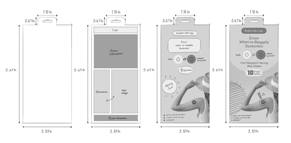
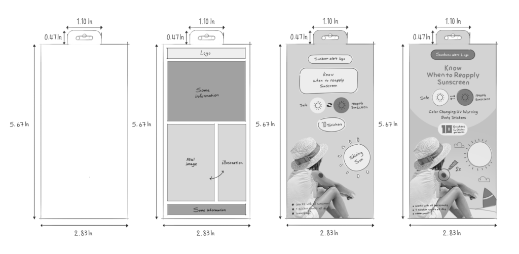
Size
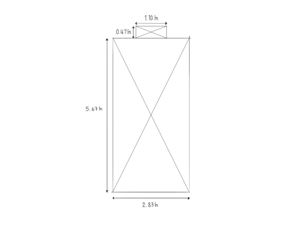
The package was 5.6″*2.8″ inches in length and width. Since this skincare product would be on the shelves in a vertical position, the design had to be vertical as well. Having only one side and one axis to work with has robbed us of the freedom to design in any way we find suitable and made our job more challenging.
Sketch
In the initial stage, we outlined every element’s expected location and place. This, however, was not absolute; it only provided an overall picture that could change.
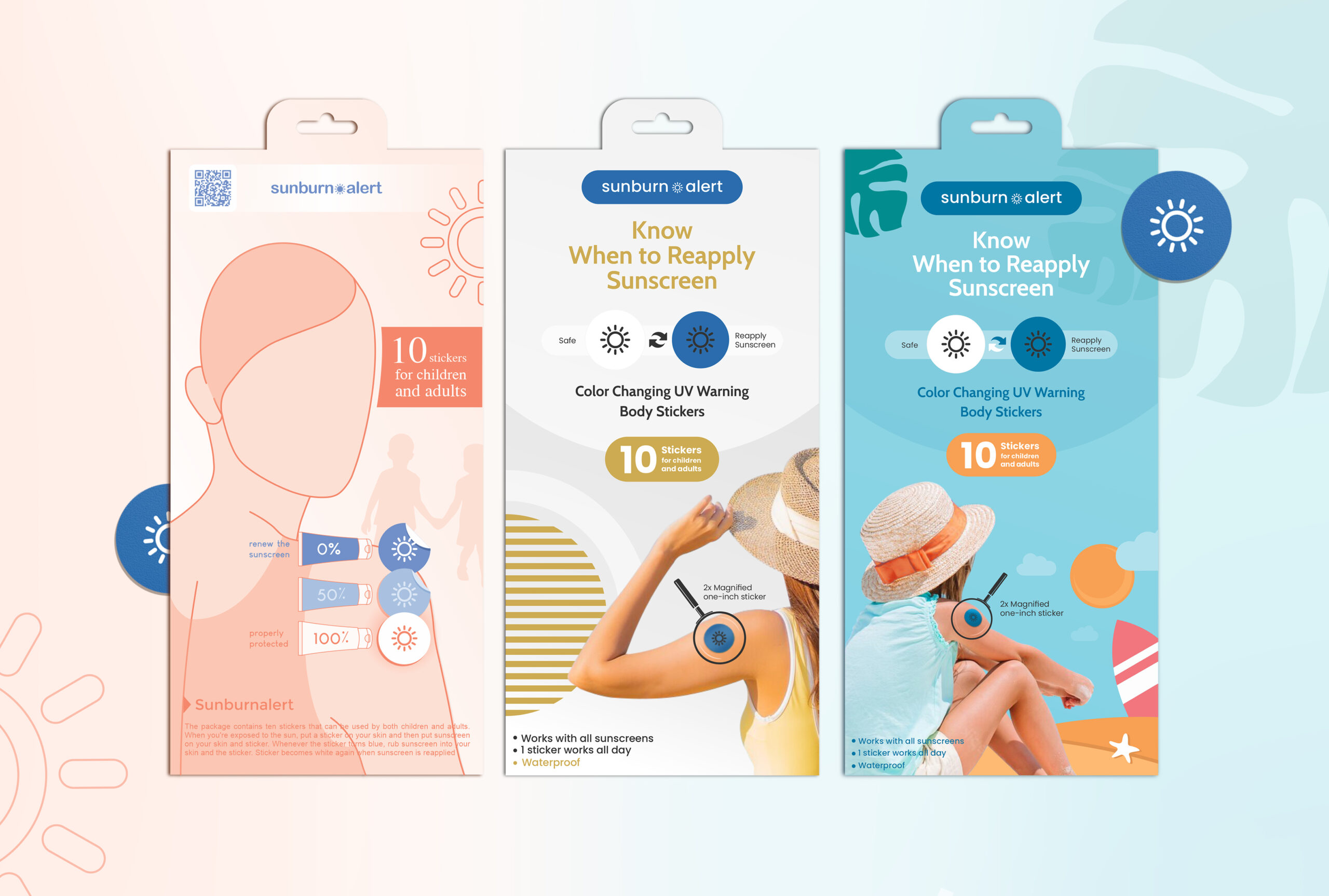
Below you can see three different design drafts that we came up with.
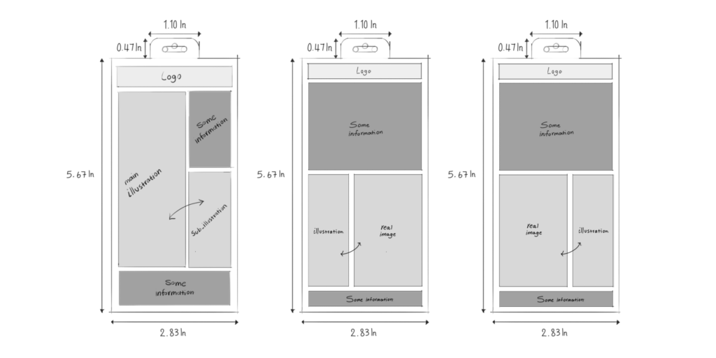
First Concept
After figuring out the location of each element in the first design, we drew a rough sketch. In the foreground, we sketched a woman with the sun shining on her as the main illustration. We used the sun in this design to emphasize the need to apply these stickers to fully protect the skin. The sticker icons are near the arm to show that the arm is a good spot to apply stickers because it is less hairy, oily, and sweaty. These icons also show that the whiter the sticker, the more protected you are, while the darker or bluer, the more exposed you are to UV rays.
As the design proceeded, we added further details. For example, we threw in silhouettes of children in the background to flesh out the illustration. This shows that the packaging design is suitable for both children and adults. We also integrated tubes of sunscreen into our design to guarantee that this skincare product was related to sunscreen. These illustrations also can aid in the clear transmission of information. In order to satisfy the needs of people who require comprehensive information, we included additional details of this skincare product at the very bottom of the packaging. Besides all these, it was necessary to include the logo and the number of stickers in each package. So we opted to place them in an easy-to-spot place.
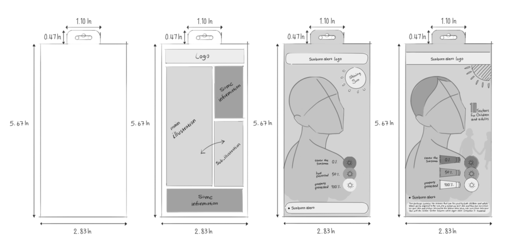
Final Design of the First Concept
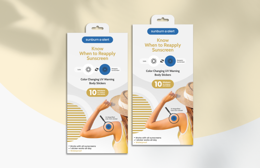
You probably already know that overwhelming users with information might divert their attention away from the main message. To stick to minimalism, we left out the sun and the woman’s details in favor of more simplified silhouettes. So we simply drew borders for the body and hair. Overall, this packaging is minimalistic and neutral in color, as is typical of European design.
Second Concept
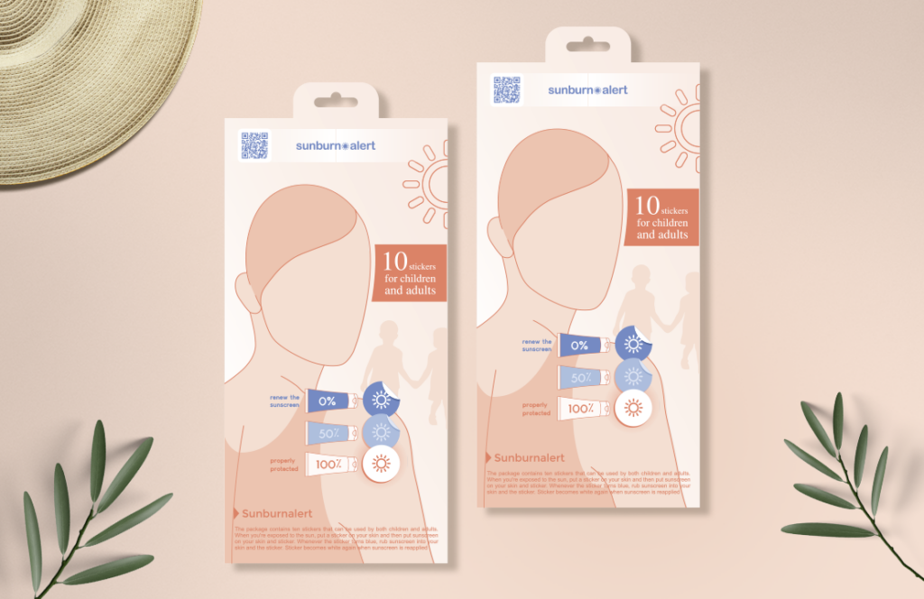
This scenario is based on a real image because images improve the transfer of messages and instantly set the mood. So we used a photo of a woman with a sticker on her arm to help the prospective customers recognize this skincare product quickly and realize that this is a product that will be stuck on the arm. By spotting the sticker on the arm, customers may wonder, “what’s this thing on the arm?”
Then the eye-catching typeface “know when to reapply sunscreen” adds to customers’ curiosity. It may also spark their interest in this skincare product and make them question why they should stick it to the arm. Soon after, we demonstrated the color change and explained the message to users. The packaging design shows that while the sticker is white, you’re safe, and when it’s blue, you need to reapply sunscreen. So, similar to an adventure, we let customers discover things through a story, which will undoubtedly make this skincare product unforgettable. Plus, it’s much like a puzzle; the design doesn’t overload customers since the information is provided to them gradually.
In the photo we’ve chosen, the sunlight is directed toward the person, even in the absence of the sun’s image. We used light colors to convey a sunny atmosphere and to imply that the sun is in the background.
Final Design of the Second Concept
The photo of a woman wearing a wide-brimmed hat out in the sun arouses the feeling of being at the beach and basking in the sunlight. When you think of the beach, you can’t help but remember the sweltering heat and sunburn. The sticker of a sunburn alert on the woman’s arm attracts attention. Once the attention is grabbed, typography and other design elements come into action and clarify everything about this skincare product.
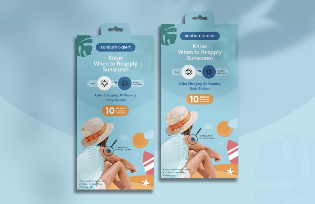
Third Concept
The only difference between this packaging design and the second one is that this is specifically about children. The prior one was for grownups. Due to their delicate skin, children must protect themselves against UV radiation at all costs. Thus, creating a packaging design just for them would be highly beneficial. This skincare product reminds children to reapply sunscreen regularly and reassures parents that their children are safe in the sun. Making a distinction between children and adults and creating unique designs for each of them encourage customers to confide in you more. Also, it provides your business with a distinct personality that caters to the needs of both children and adults.
In contrast to the second design, which depicted the sun in an abstract way, in this design, the sun is visible to further highlight the dangers of sun exposure to children.
Final Design of the Third Concept
The words that come to mind when looking at this design are sunny resorts, sandcastles, scorching heat, etc.
Beach vibes are aroused through a boy wearing a sticker on his arm. He is freely sitting in front of the sun in a very relieving way. Vivid colors, blue sky, green leaves, and a red windsurfing board further emphasize the beach vibes. In fact, we tried to illustrate a flat beach design.
Conclusion
Design can change the way a product is perceived. A well-thought-out packaging and design with a storyline make products stand out, and skincare products are no exception.
But does a good design appear out of the blue?
What makes a good design?
Check out our other packaging articles as well.