One of our recent projects was a landing page design for Tech Valley, a digital marketing and consulting agency based in Dubai. They work in the crypto and Web3 space, supporting startups and global projects with everything from licensing and regulation to investor networking and event partnerships.
From the start, this project felt like a unique challenge. When our clients reached out to us, they made it clear that they are after an immersive user experience. The project brief hinted at a story-driven user experience with a strong visual identity. They mentioned their love for space themes, smooth motion design, and 3D graphics that would refer to technology and progress.
So that’s where we began: how do we turn a Web3 service platform into a unified, interactive digital journey?
Research and Visual Direction
We began by reviewing the references provided by the client, including websites like Spaace.io and a selection of curated motion design reels from Instagram and YouTube. Our primary research gave us a few consistent themes: minimal text, cinematic transitions, immersive motion, and a strong visual hierarchy.
These references gave us a clear understanding of the visual tone the client was aiming for. Adjectives that best describe it are futuristic, bold, slightly abstract, yet still clean and refined. Once we had this in hand, we defined our direction early on. We set out to keep the messaging simple, focus on visual storytelling through motion design, and ensure every interaction felt deliberate and well-paced.
The Concept: One Scroll, One Story
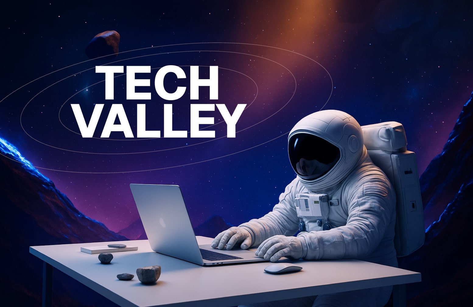
Instead of a traditional layout with disconnected sections, we decided to structure the site as a continuous scroll. Our central storytelling device must have been a figure that would travel with the user across the site. We chose an astronaut to match the client’s preference for a space-themed interface. Here is our noted plan:
Each scroll will introduce a new “galaxy,” where a core service of Tech Valley is revealed in context. This approach gave the site a natural rhythm. The astronaut becomes a silent guide through topics like licensing in the UAE, AI-driven projects, DeFi, investment facilitation, and more. The experience flows smoothly, and each interaction feels like part of a bigger picture.
Visual Direction
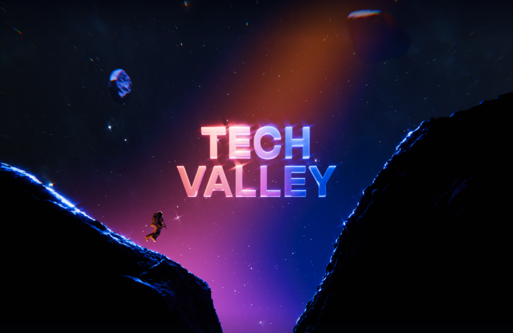
We leaned into a dark visual theme with subtle glows, glass textures, and deep-space tones. The idea was to balance the mystery of the unknown with the confidence of a grounded, experienced team.
In addition, we designed high-tech 3D visuals to support the drafted story. For example:
- The licensing section features structured 3D forms that resemble secure vaults and networks.
- In the investment and partnership sections, we introduced an orbit of floating partner cards and animated logos.
- Subtle scroll-triggered animations give each section a sense of movement and transition, without overwhelming the user.
At the very end of the page, the astronaut stops. In the reflection of the helmet, you can see the Dubai skyline. It is a subtle reminder that Tech Valley, despite its futuristic direction, is rooted in a powerful and growing tech hub.
Project Goals
We defined four clear design goals at the beginning of the project:
- Create a high-impact first impression that sets Tech Valley apart in the Web3 market.
- Introduce their services through interaction, so users stay engaged from start to finish.
- Reflect their dual identity: visionary innovation and real-world government + investor relations.
- Build an adaptable, mobile-friendly UI system that allows for visual complexity without compromising usability.
UX, Layout, and Interaction Design
Even though we had a strong narrative concept, we kept usability at the center of the experience. That meant:
- A responsive layout that adapts fluidly across devices.
- Clear navigation cues without using a traditional navigation bar.
- Interactive cards for services, designed with a 3D micro-interaction layer to invite exploration.
- Light-weight performance optimization to support 3D and motion design without compromising speed.
We created a full design system for Tech Valley’s future scalability. The system includes buttons, cards, text styles, and layout grids.
Motion Design and Micro-Interactions
This project relied heavily on motion design. The main drive was for aesthetics, but we made use of motion for our user orientation and engagement. Some of our motion design elements are the astronaut floats with inertia, buttons that pulse gently on hover, and flipping cards that rotate or glow with soft transitions. Each detail was carefully refined so the motion feels natural and smooth across scroll, tap, and swipe interactions.
We also considered how this animation experience would behave on mobile. All major interactions were tested and reworked for smaller screens to maintain the immersive effect while simplifying elements where needed.
Services Section: 3D Design and Clarity
One of the key sections was the “Solutions” area. It involved a set of interactive 3D cards that explained Tech Valley’s core services. We combined clear copy, iconography, and custom animations to give each service a distinct visual identity. These cards respond to cursor movement with a glassy, depth-driven look that captures attention and improves click-through rates.
Tone of Voice and Messaging
Alongside the UI, we worked on refining the site’s tone. We aimed for a tone that felt fresh and self-assured, without relying on the overused jargon that’s everywhere in the Web3 space. We wrote clear, professional copy that aligns with Tech Valley’s target audience: investors, entrepreneurs, government partners, and startup founders. The messaging stays focused on results, while still embracing the futuristic energy of the visuals.
Typographic Expression of Tone
Typography played an important role in supporting the tone visually. We selected a modern sans-serif font that felt confident but not overly stylized. Headlines were spaced out to give them breathing room and reinforce clarity, while body copy remained light and readable. This was important because the copy and motion had to work together. As the astronaut moves through the site, each message appears in sync with visual cues, with a balanced pacing in appearance.
Final Results
The final landing page is both a story and a showcase. It brings together strong UI/UX foundations, original 3D design, and smooth motion to create something memorable. More importantly, it reflects who Tech Valley is. We presented Tech Valley as a forward-thinking agency that’s deeply connected to the digital future and the real-world business ecosystem in the UAE.
We’re proud of the outcome, and more than that, we’re proud of the process. A clear vision, a collaborative client, and a talented team came together to turn a complex brief into a cohesive, interactive web experience.
For more articles like this, visit our blog. You can also check our Dribbble for more work from our team.