Technology is growing at an amazing pace like never before. Its impact has gone far beyond affecting everything including pets. But how are pets affected by technology? One example is a veterinarian management system. It is a service that lets you keep track of your pets’ health history, find a veterinary clinic, and schedule an appointment. With this service, it is easy to take care of your pets. This case study will walk you through the steps we took to create the brand identity and user interface/experience for SmartDVM, a veterinary management system for veterinarians, veterinary clinics, and pet owners.
Brand Identity Design for SmartDVM
Branding is very important when it comes to giving a product its unique identity. In the case of SmartDVM, we achieved this by employing a wide range of marketing and psychological techniques in logo design, color and typography choice, and illustrative elements, all of which are intended to elicit a certain emotional response from the target audience. We will discuss each separately.
Logo
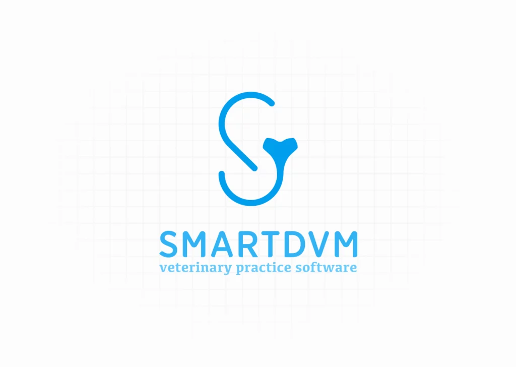
The mere existence of a logo may seem meaningless! However, with respect to a brand, it might transform your name into a visual trigger. SmartDVM, being a platform providing clinical services to pets, needed to make itself clear in its logo. To achieve this, we created an abstract logo for SmartDVM using a stethoscope and the first letter of the company’s name.
Color Palette
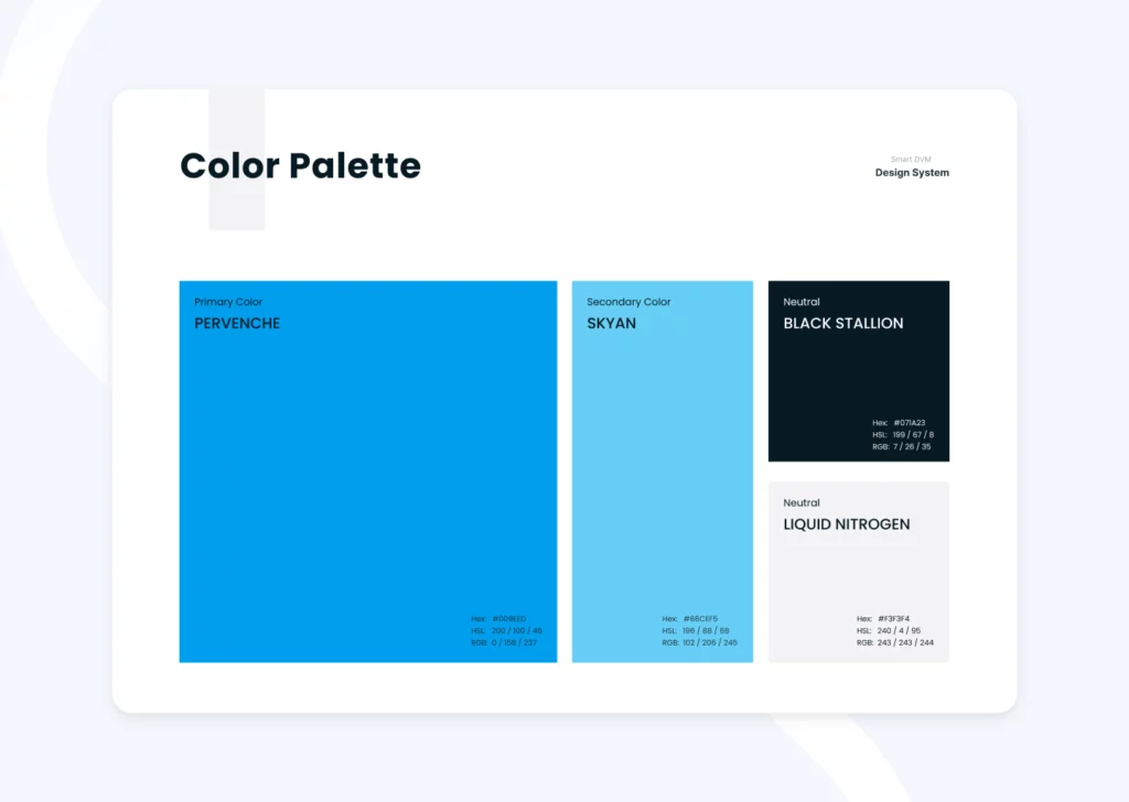
It goes without saying that color is a key factor in expressing your brand’s personality. Blue and orange were the primary colors we settled on for SmartDVM. Blue is primarily connected with peace and trust in color psychology. That’s why the logo and certain other aspects of the UI are predominantly blue to instill trust in the audience. On the other side, we also used orange, the complementary color of blue, in certain UI elements. It conveys feelings of excitement and warmth.
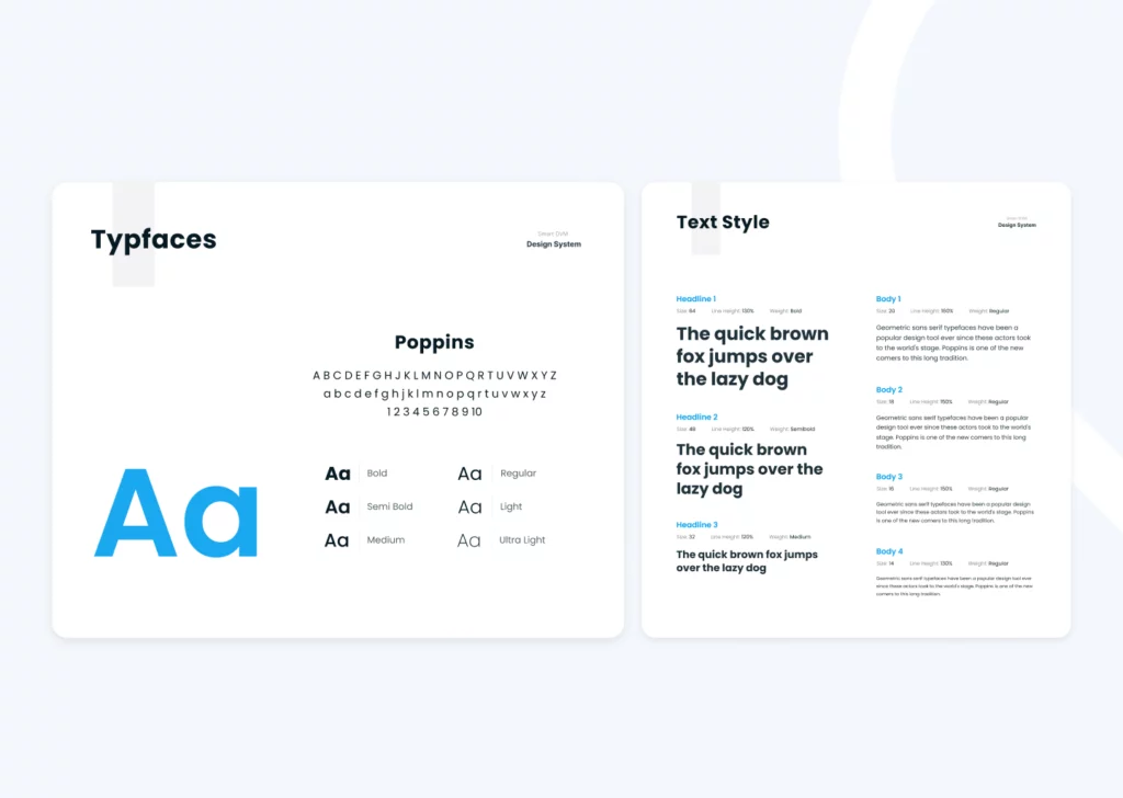
Typography
What made us pick the Poppins typeface for SmartDVM? Since SmartDVM was a pet-centric platform that took into account pet owners’ feelings and emotions, we decided to go with Poppins. Poppins is a font in the geometric Sans Serif family, which has become popular in web design. Poppins is a friendly, approachable typeface with a nice height and generous spacing between the letters that conveys a positive vibe to the reader, much like the love and companionship that pet owners feel for their pets.
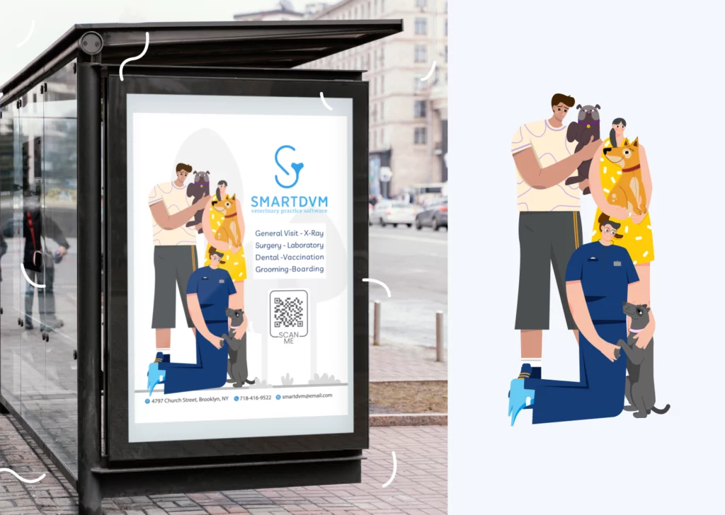
Illustration
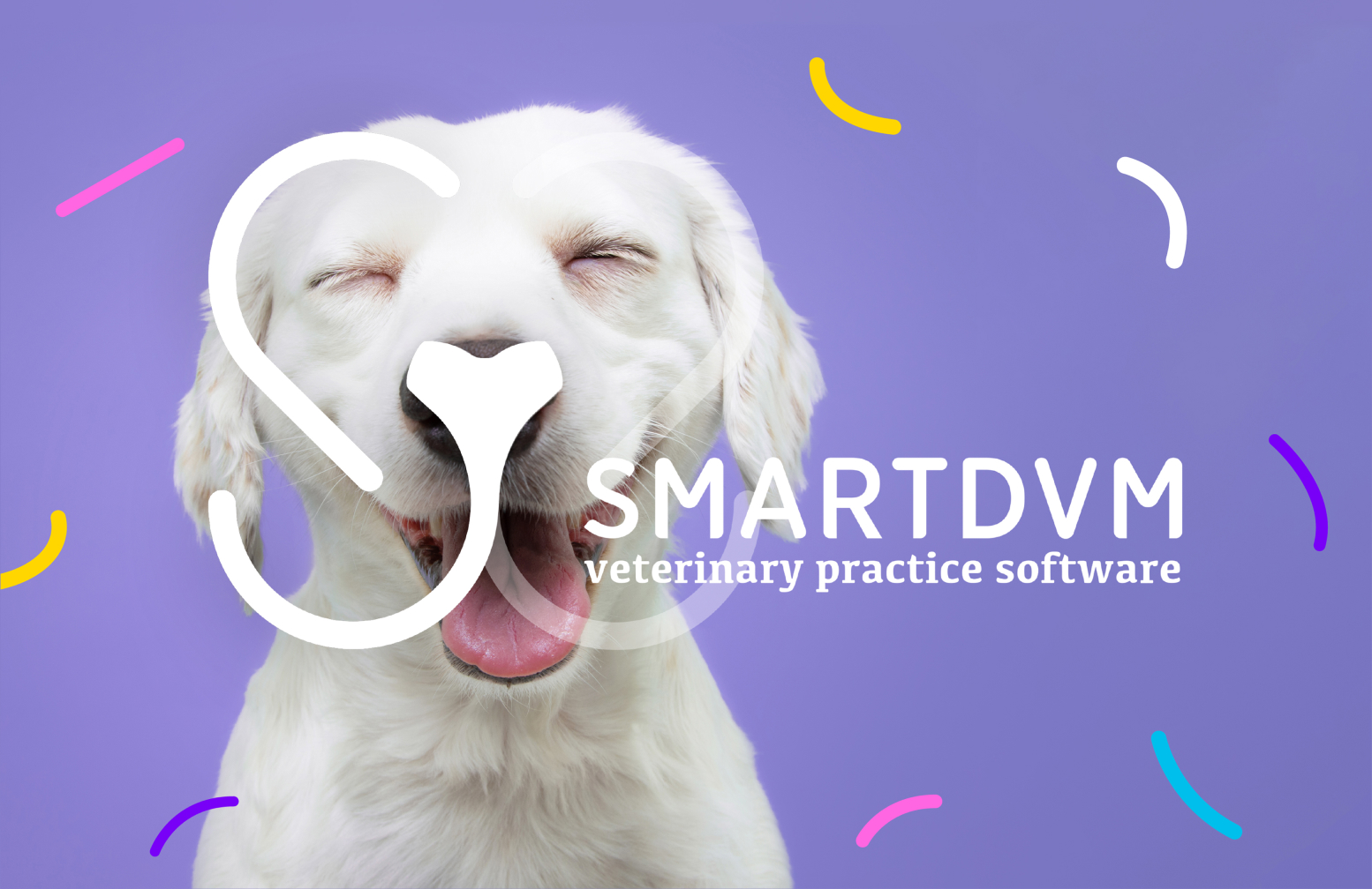
What’s the next step after deciding on logos, color schemes, and fonts? This is where the illustration comes in. The illustration is probably the most important part of branding. Because it brings a brand to life, tells the story of the brand, and makes the concept clearer. It also gives the brand of a company more depth, personality, and feeling.
Take a look at the illustrations of SmartDVM; when you look at it, what emotions come to mind? Love is in the air for pets, as their owners and health providers take excellent care of them. When you look at these drawings, what other thoughts and emotions come into your head? Peace of mind, security, etc.
UI/UX Design
After branding design, it was time to design UI and UX.
When designing the UI/UX of the website, it was necessary to consider the two different types of users who would be using the platform. The first group was “direct users” who would register via SmartDVM. These included hospitals, clinics, and solo practices for whom we provisioned the hospital system. The other was “indirect users,” including clients, pet owners, and hospital staff members.
Research
Our research was twofold. In order to understand what pet owners want from a veterinary management system, we first had interviews with pet owners. The following is what we found out. They mainly desired a straightforward and user-friendly platform. A platform that could quickly connect them to the closest available veterinarian, one that could remind them of their appointments and vaccination due dates, and one that could lighten the load of a busy person.
In the second part of our research, we looked at the competition. Before we began the design process, we looked into some of the biggest competitors in the industry. By doing this, we were able to figure out what each of the pet telehealth sites did well and what they could improve on. The findings are as follows:
Advantages:
- Easy to use
Disadvantages:
- Confusion
- Invoicing differences
- difficulty in finding the client or patient
- Lack of a separate field for annual vaccination and a separate reminder for that.
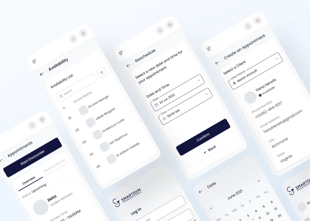
Wireframing
After looking at the UX, we designed wireframes for each section on Figma to bring them to life. By making wireframes, we were able to find potential problems and solve them. Designing a wireframe lets you map out how the pages work, find problems early, and save time on revisions later. It is much easier to make changes to a wireframe.
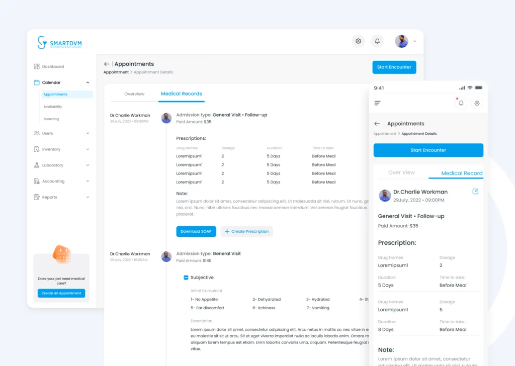
The key goal we set for ourselves was accessibility and usability, therefore we made high-fidelity screens for both the desktop and mobile versions. There were some problems along the way, and we had to keep talking to our clients about them. By doing so, we were able to solve many of these problems. For instance, in the medical records section, we decided to add “create prescription” and “download SAOP” to make things easier for users. So, designing wireframes helps us solve these problems and come up with the right and exact product. It also speeds up the process of designing UI.
Prototyping
What makes prototyping such an important process? The prototyping process enables designers to test their designs prior to development. This is highly essential since it allows for possible issues and pain points to be fixed easily before the development and without investing a lot of time or money.
So, using prototyping, we were able to evaluate the user experience to see how people felt while using the platform and to identify any misunderstandings that might have occurred.
Were there any difficult moments during the prototype process?
Mobile
In order to make the website look attractive and function successfully, it was vital to think about how it would work on mobile devices. A quick look at a couple of the screens on the mobile device is provided below.
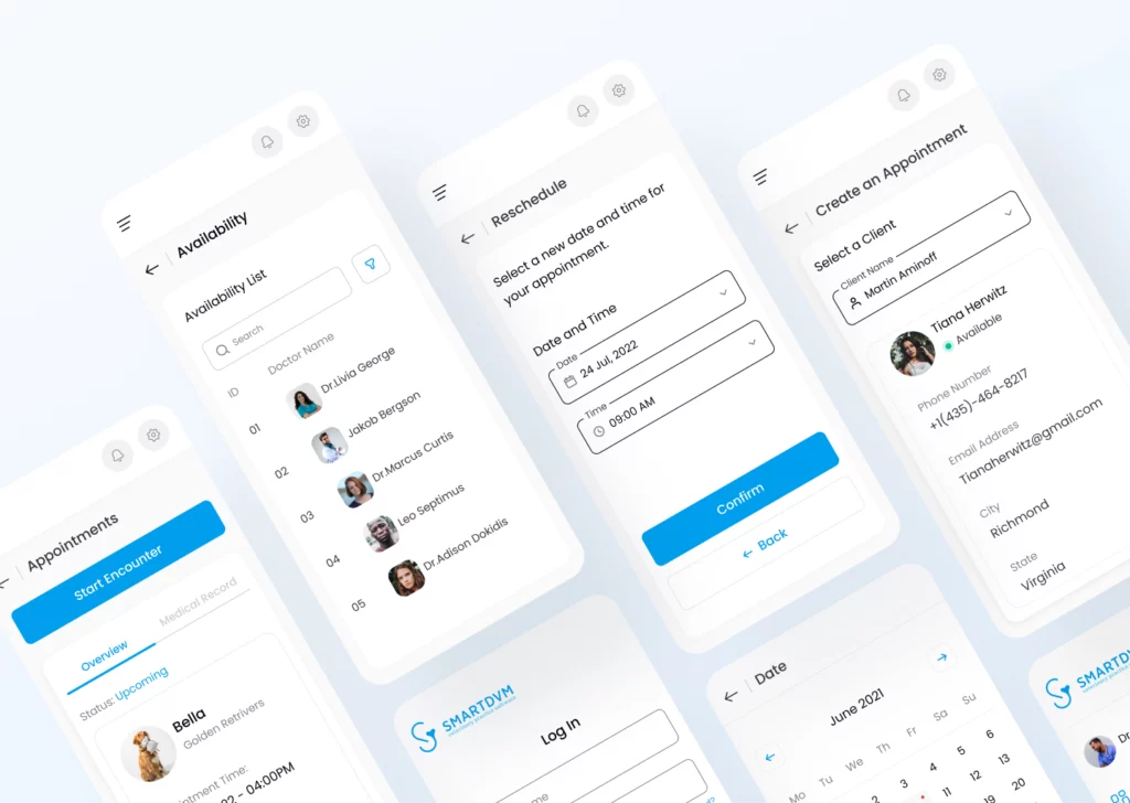
Final Design
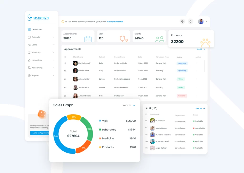
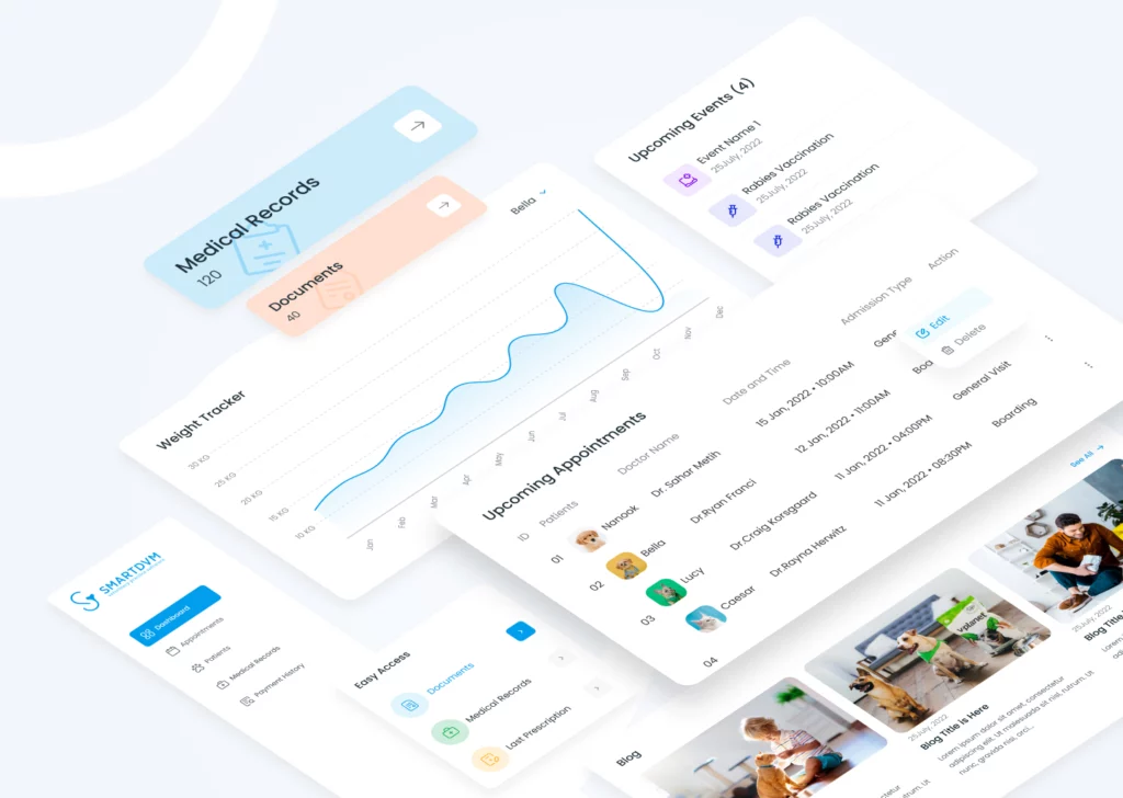
After going through all of these different phases, we were finally able to create a design that was not only user-friendly but also easy and straightforward to use. You may get an idea of the finished product by looking at the following shots.
Check out our previous articles at https://abron.co/blog/.
Check out our articles on Medium.