If you are an investment company offering investment services or if you are thinking of launching a website for your business and getting a unique UI design, please make sure to continue reading to get to know how our studio can help you. Now, let’s take a look at what we mean by UI design for an investment company.
In this case study, you’ll get to know an investment brand called Verona, for which we did a thorough UI/UX design. We’ll walk you through a full understanding of what it means to design a UI/UX, the UX research we did for Verona, the brand alignment and application of brand voice into the UI design, pain points of the competitors, edges we crafted for Verona’s visual communication, and a review of user experience with similar competitor websites.
Project Scope
UI/UX Design
Project Brief
Verona strives to improve the life standards of community members at both individual and social levels. It aims to develop investment means and programs that meet the needs of users and apply the highest standards of professionalism and discrimination. In this project, our goal is to introduce Verona and its investment areas and provide a feature that would give users a comprehensive investment guide.
Project Goal
When setting up our project goals, we agreed on prioritizing these features:
- To share information about the investment areas
- Profit amount based on investment amount
- The highest amount of discrimination
- To be the users’ top investment choice
UI/UX Design Process
In this section, we go over our UI/UX design process from the initial research phase to final design implementation:
Discovery
- User Research/ Needs
- Business Requirements
Before the actual design process, we did a thorough analysis, getting to know Verona, the brand’s mission and vision, and its business goals. We read Verona as a collective endeavor to invest in a sustainable future and progress, alongside contributing. During our UX research, we wanted to find out answers to questions like:
- What type of investment platform do users need?
- What are the pain points of the competitors?
- What investment types attract users the most?
UX Research
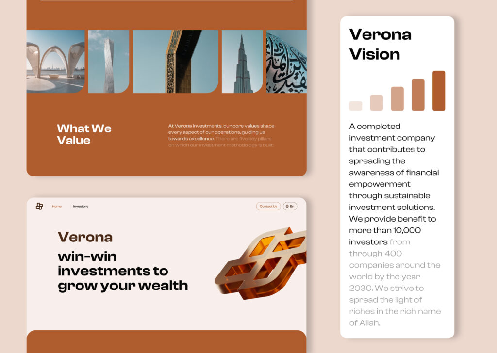
One of the research methods we applied was analyzing competitor websites. For the design, we chose colors based on Verona’s branding palette, with brown orange as the primary color. This was an ideal choice to reflect the sandy landscapes of Dubai. Additionally, we incorporated numerous images of Dubai to emphasize its current architectural look, which conveys a sense of growth to users.
Precisely, images of iconic landmarks are used, including the Burj Khalifa the tallest tower in the world, the Museum of the Future with its energy-efficient and environmentally conscious design, the Dubai Frame’s sustainable structure that filters UV and IR radiation, the Cayan Tower (also known as the Infinity Tower) with its dynamic architectural design, and many other futuristic marvels.
Once we put together these, we crafted a UI that strengthens the image of a trustworthy, future-forward, and progressive Verona.
UI/UX Analysis: Key Findings from Competitor Analysis
To find answers, we used online user reviews and ratings about certain similar products. We categorized the findings based on the user’s experience of the service, their recommendations, and features that might feel redundant to them. Our target audience was investors who were interested in sustainable and profitable investments. These would not only lead to a win-win situation but also contribute to the goal of saving the planet.
UX research also indicated that many users were looking for investment information in simple terms. Needless to say, a comprehensive explanation of investment opportunities and their requirements was often overlooked. The investors would also favor establishing a savings culture for their future.
- Simplicity Matters: Users prefer clear, concise explanations of investment opportunities.
- Sustainability Wins: Investors are drawn to options that contribute to a better future.
- Saving Culture: There’s a growing interest in building long-term saving habits.
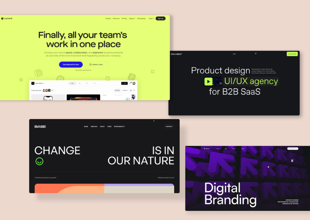
Mapping out the four selected Inspirational UI designs
Images of Dubai were prevalent among competitors; however, we took inspiration from some UI designs that were more interesting. Here are the four main UI designs that sparked Verona’s design ideas:
UI/UX Design: Sketching and Wireframing
The design is created with some reference to some UI designs that the client liked the most. These websites feature a balanced design with bold typography and a friendly, professional look. We tried to rearrange this to look more adaptable to a Middle Eastern atmosphere.
As with every design project, the design process begins with understanding the problem, doing thorough research, and brainstorming ideas till we find some good ones. Then, we shift from this creative design thinking to practicality by creating wireframes, prototyping, testing, and putting together our design system and style to work through the UI design in Figma.
In the case of Verona, the logo and brand colors were already provided by our client. Still, the style guide required other design elements such as a selected font, a color palette, UI images, icons, buttons, and inputs.
The primary color for Verona is called dry orange, perfectly suiting the brand’s energy, innovation, and creativity. The color palette includes two complementary colors, brown and thin black.
Additionally, incorporating Dubai’s iconic architecture and elements of growth strengthens Verona’s progressive narrative. This ideology was taken in line with the pattern design, another testament to Middle Eastern inspiration.
Investment project types include:
- Educational
- Technological
- Agricultural
- Entertainment
- Real Estate
- Industrial
- Tourism
Design Approach
Creating a platform that resonates with Middle Eastern audiences meant embracing cultural preferences while maintaining a global appeal.
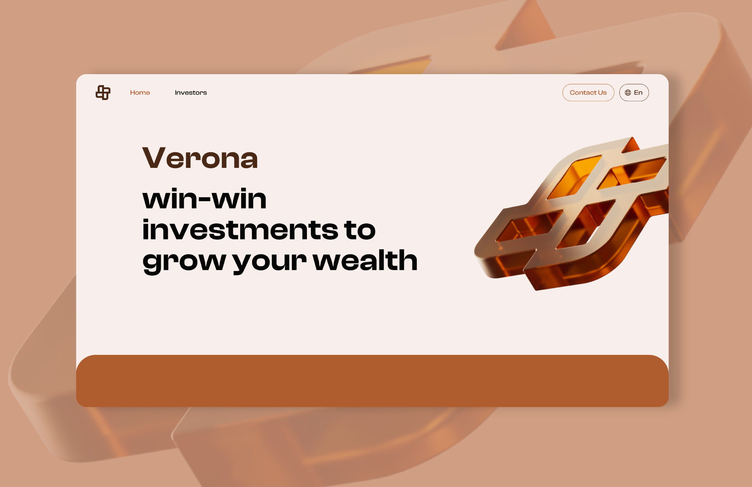
Earthy, pastel colors are inspired by Dubai’s sandy landscapes and express the region’s growth-focused ethos. The glass-like logo in brownish orange merges with Middle Eastern Art, accentuating the cultural connection for the visitors. The design choices have transformed the UI into a visual playground, where colors, shapes, and words converge.
UI Pages Designed for Verona
Three unique UI pages have been created for this investment website. While they share a cohesive visual design, each serves a distinct purpose:
Home Page
Introducing Verona with a substantial 3D glass logo at the front of the hero section and a stimulating copy that makes pausing unavoidable. Taking in the users with its visual excellence, the home page also makes Verona’s business pretty clear.
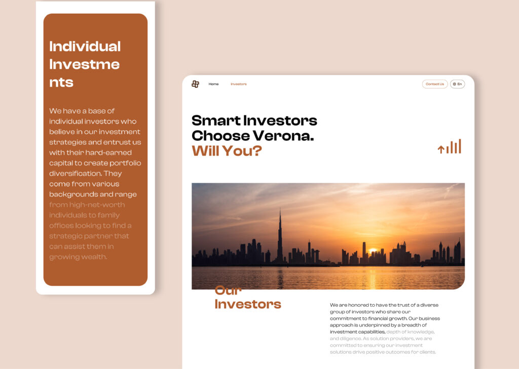
Investors Page
The page serves as a direct portal for investors and introduces Verona’s investor anatomy. The symphony of colors makes the UI worth scrolling as the hazel Dubai sunset blends into Verona’s Middle Eastern tones.
Contact Us Page
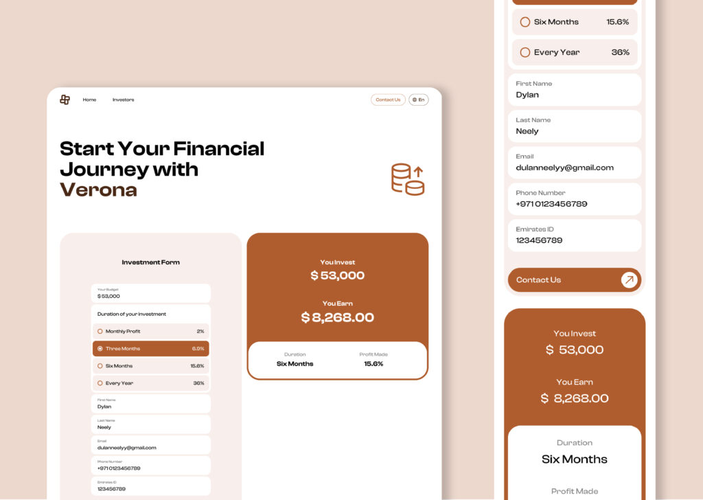
A page like this was necessary to fill the knowledge gap that users were complaining about.
We designed an investment form with a set of holding period options (One month, three months, etc.) to calculate the interest rate for users. As the user enters the investment budget, the system auto-calculates the anticipated profit amount. As the user enters the investment budget, the system automatically calculates the anticipated profit amount.
UI/UX Design: Final Results
Our final work was a digital product that accompanied all four user groups in making the right investment decisions while performing this process smoothly.
Our product included:
- A profit calculator based on the investment amount input
- A list of investment areas to choose from
- Three UI pages, including Home, Investors, and Contact Us
This case study is prepared to become a source of inspiration, introduce Abron’s work ethic, and provide businesses with design insights. If you appreciate our design approach, please continue sharing our work with those around you.
For more case studies like this, check our blog.
For more content from Abron Studio, check our socials: Dribbble I LinkedIn I Behance
