A Vibrant brand identity design for a personal blog
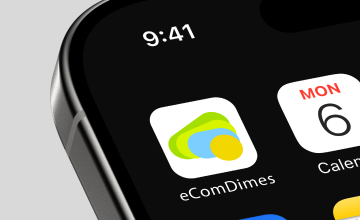
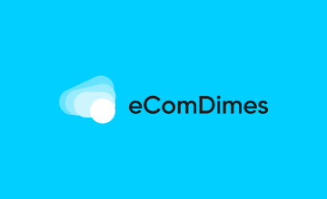
eComDimes
About Project
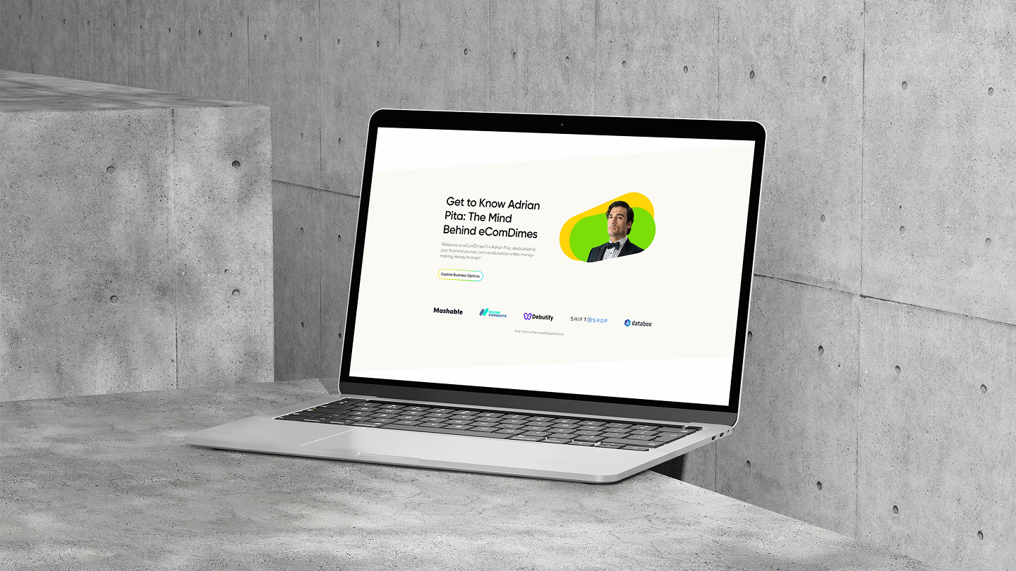
eComDimes is a personal blog platform designed for Adrian Pita, a visionary online business mentor. The blog shares valuable insights on launching online startups and practical tips for making money online.
Our Challenge
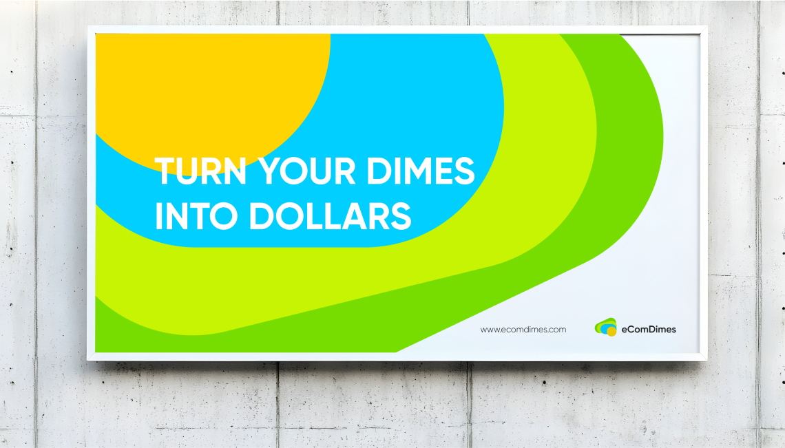
The project challenged us to capture the spirit of digital entrepreneurship and reflect the ambition of financial growth. A second key challenge was creating a logo with cross-generational appeal: bold and fresh for Gen Z and Millennials, yet credible and trustworthy for seasoned merchandisers.


Our Solution
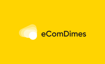
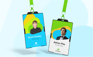
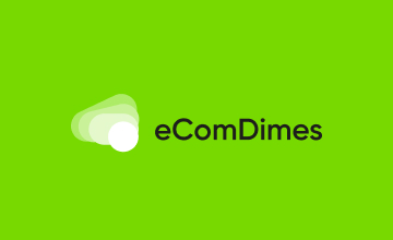
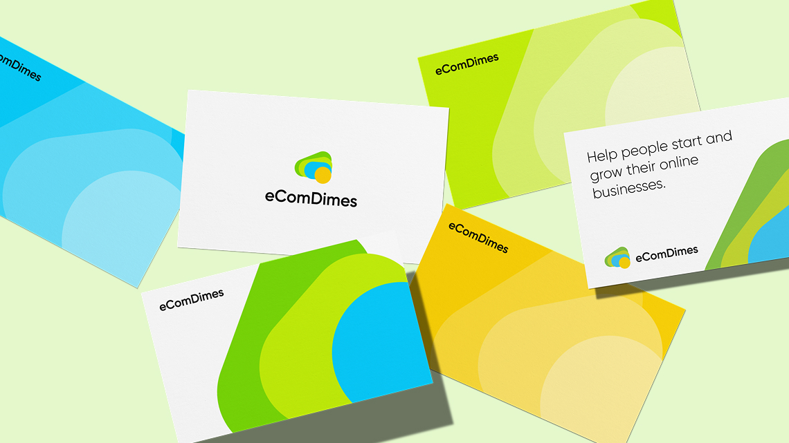
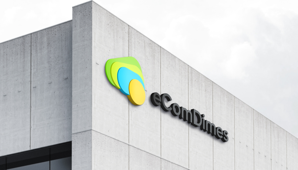
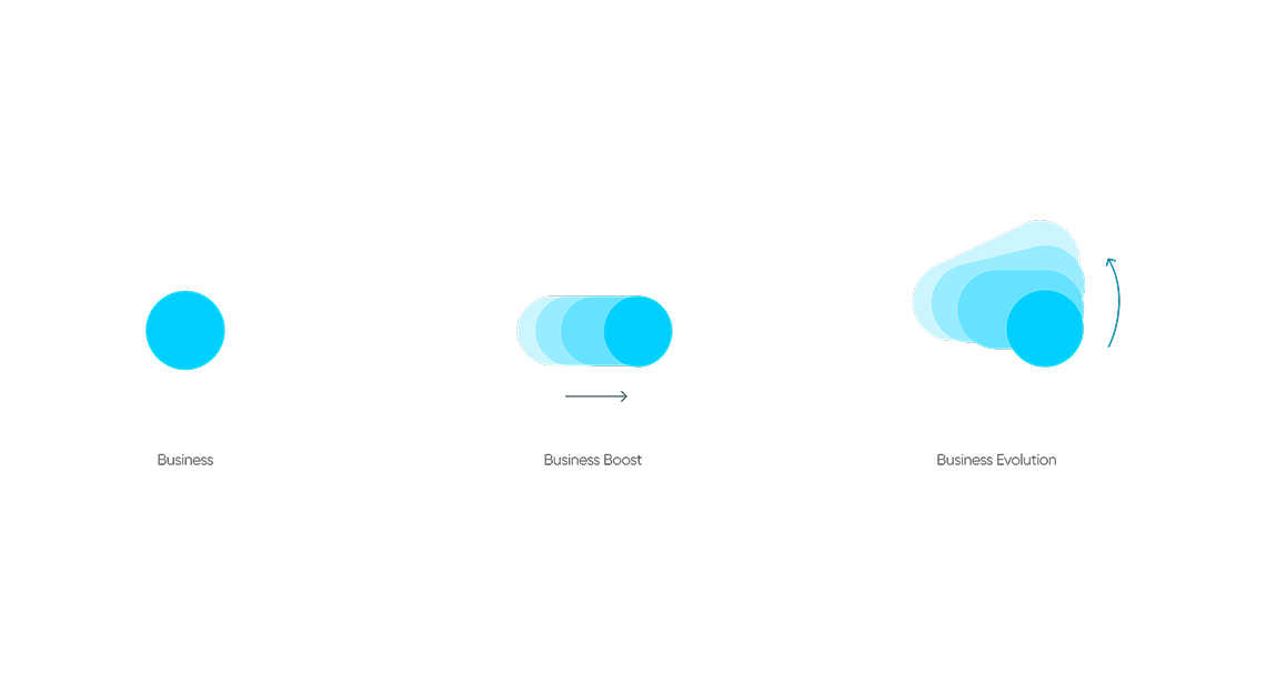
We created a scalable brand identity that blends innovation with credibility. A minimalist logo and vibrant color system symbolize business growth and appeal to both Gen Z entrepreneurs and seasoned professionals. The logo’s layered design and bold palette form a recognizable visual identity that communicates progress, energy, and financial empowerment.
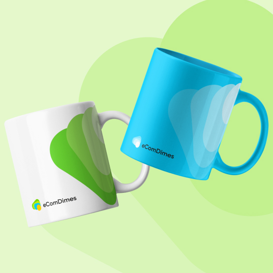
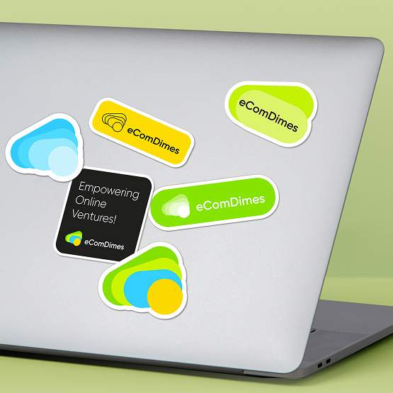
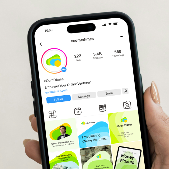
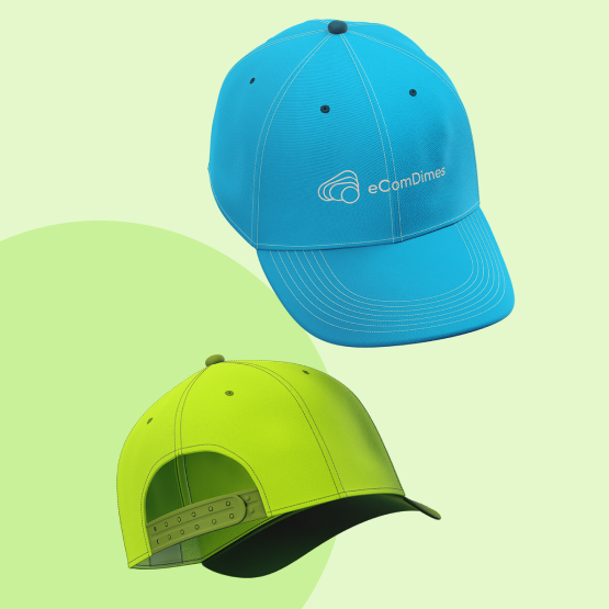
We applied the brand colors across various mockups, including mugs, caps, and stickers featuring the logo. For brand communication, we chose a clean sans-serif typeface, Gilroy, to evoke a sense of friendliness and trust.