Healthcare Branding for a Modern Eye Surgery Clinic
Eye Surgeons

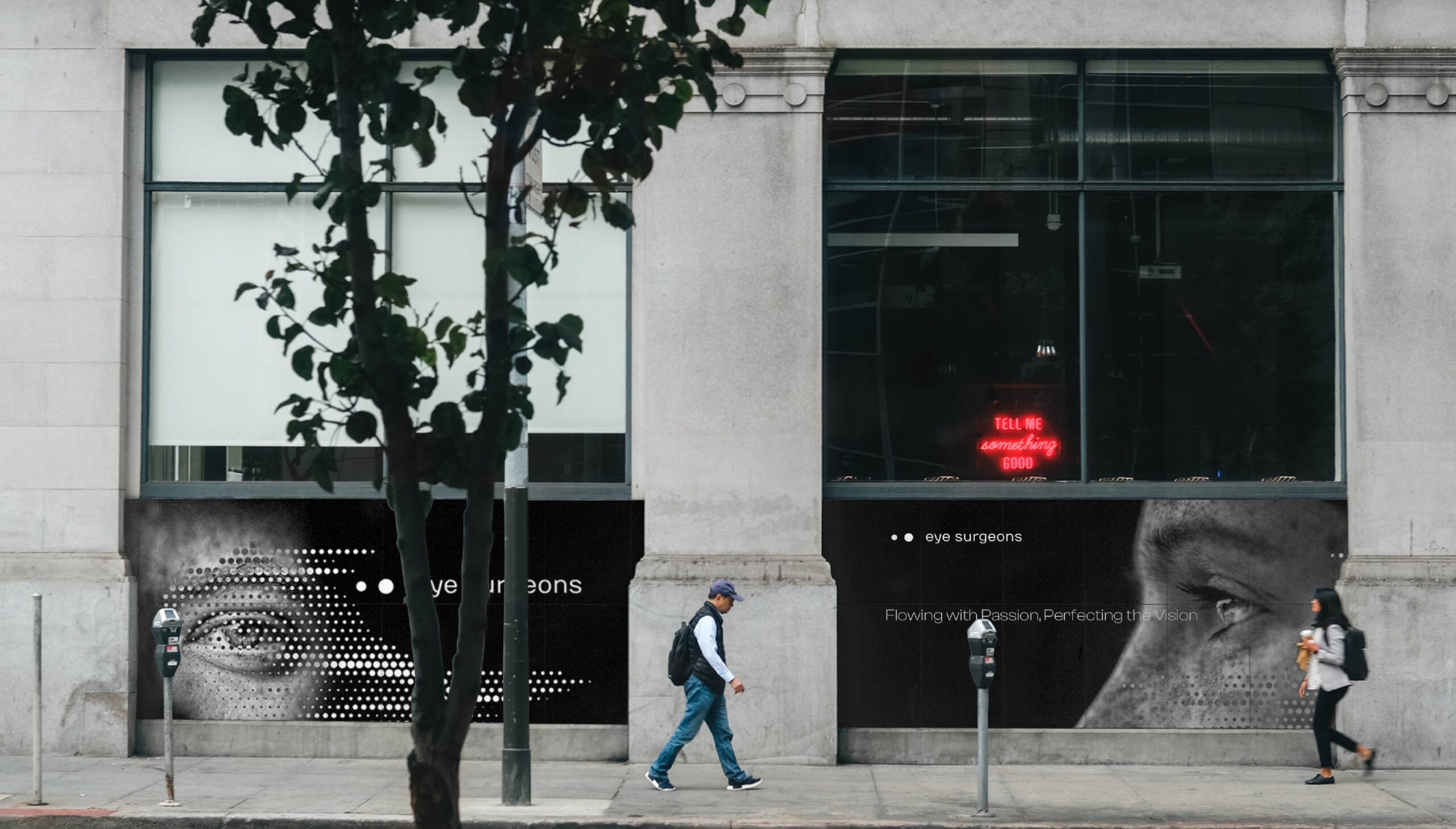
About Project
Eye Surgeons is a truly human-centered eye clinic. Our goal was to create a brand that felt modern, trustworthy, and personal. We had to reflect their use of advanced technology and commitment to a clear vision.
Our Challenge
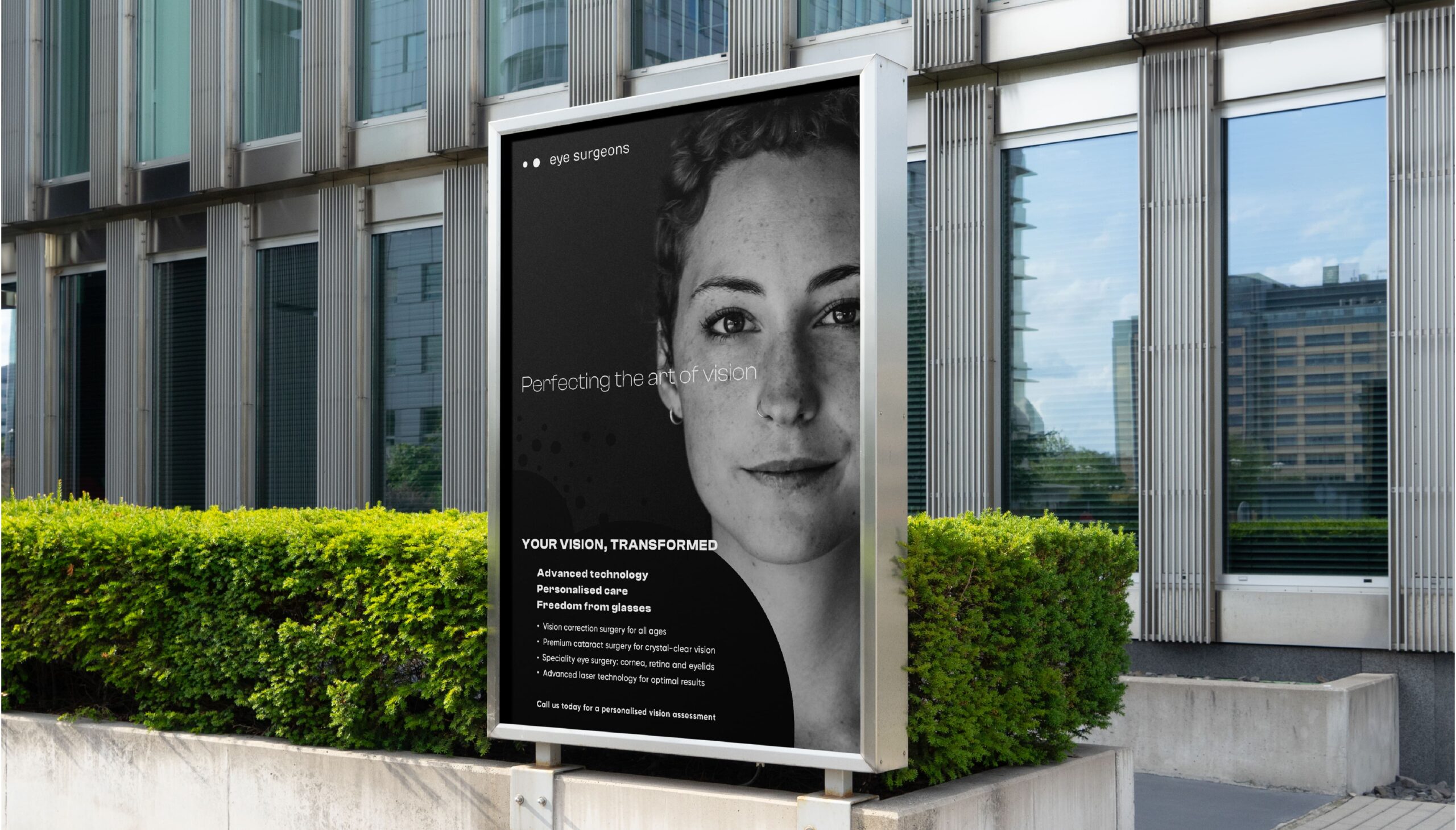
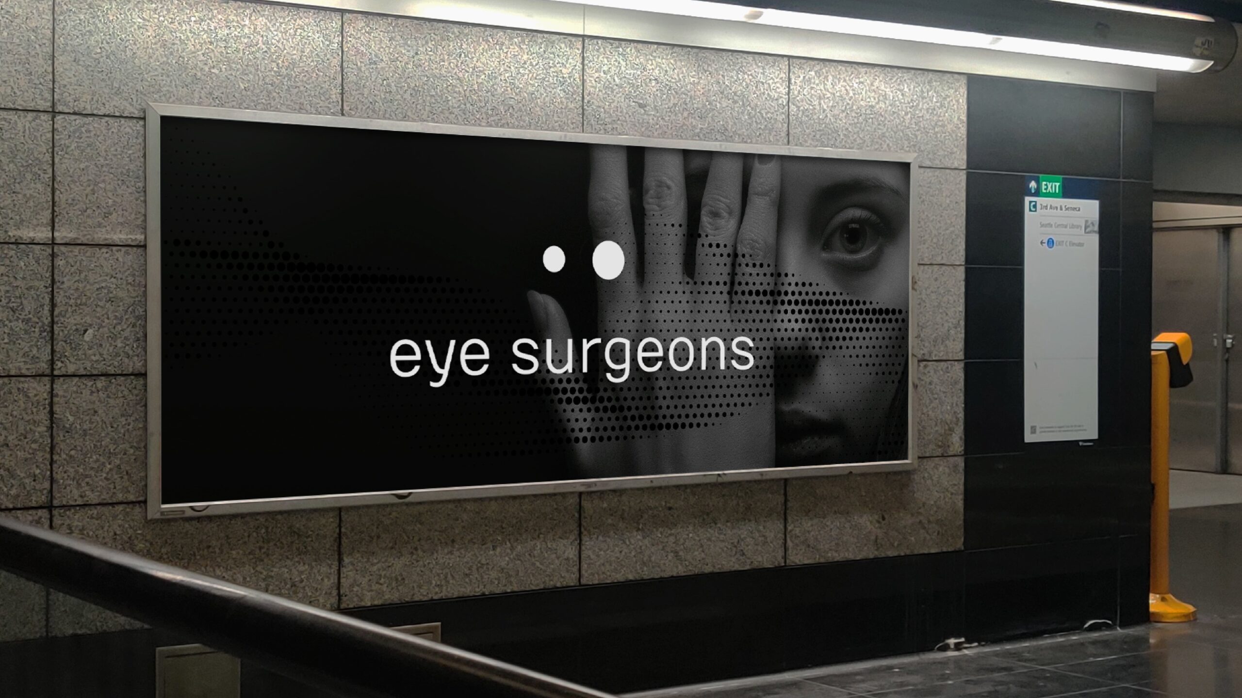
The biggest challenge was balance. The brand needed to look unique but not decorative, modern but still warm and approachable. And it couldn’t use any eye symbols or the usual medical colors. We had to find a new visual way to express trust, care, and precision.
Our Solution
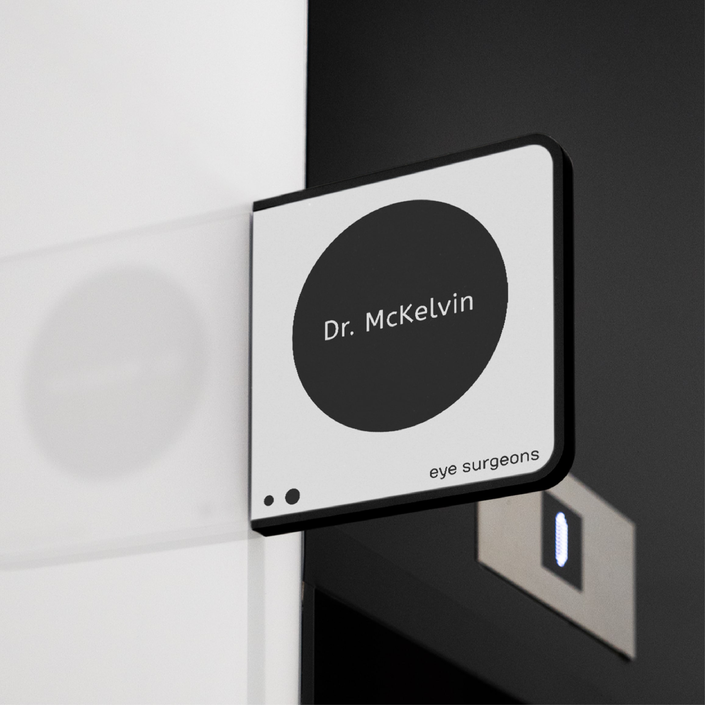
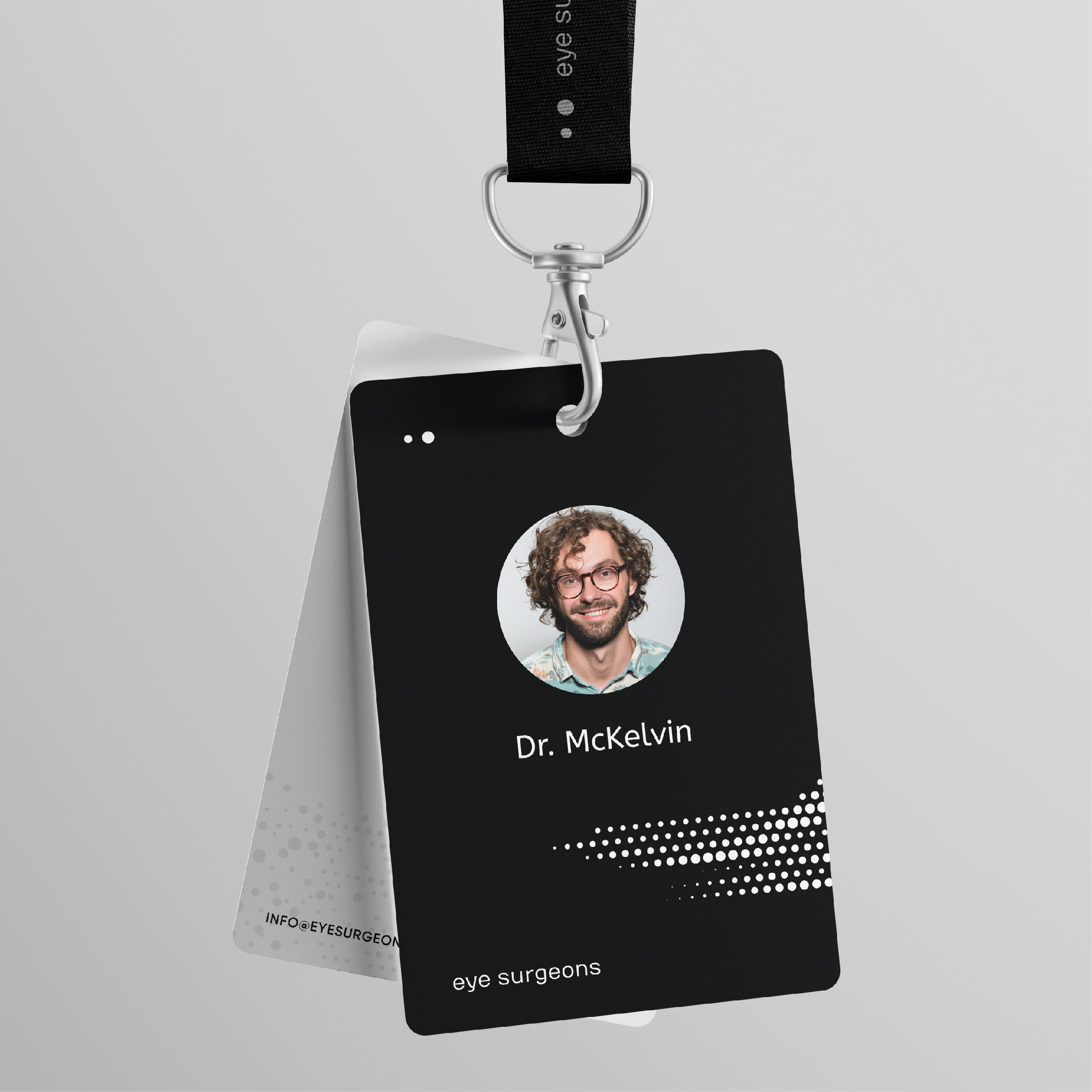
We avoided eye symbols and looked instead for a form that could carry meaning without being direct. The idea of two offset circles came from the relationship between patient and surgeon. From that, we built a system using quiet colors, clear typography, and a layout language that felt human and precise.


The brand now reflects Eye Surgeon as precise, approachable, forward-thinking. Staff feel proud to use it. Patients have described it as calming, modern, and different. and this was exactly what our team hoped for.