A Fresh, Uplifting Identity for A New-generation Productivity Brand
SunDrop
About Project
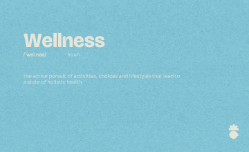
SunDrop is a productivity and wellness brand designed to help people start their day with clarity, focus, and optimism. Its identity blends the symbolism of a sunrise with the calm precision of a single drop, representing new beginnings, balance, and mindful productivity. We were tasked with shaping a brand system that feels uplifting, minimal, and approachable across both digital and physical products.
Our Challenge
SunDrop had to balance two worlds: productivity and wellness. Many productivity apps feel rigid and utilitarian, while wellness brands tend to be soft and emotional. The challenge was to create an identity that delivers structure without pressure, and warmth without clutter something that inspires users at the start of each day while staying clear, modern, and versatile.

Our Solution
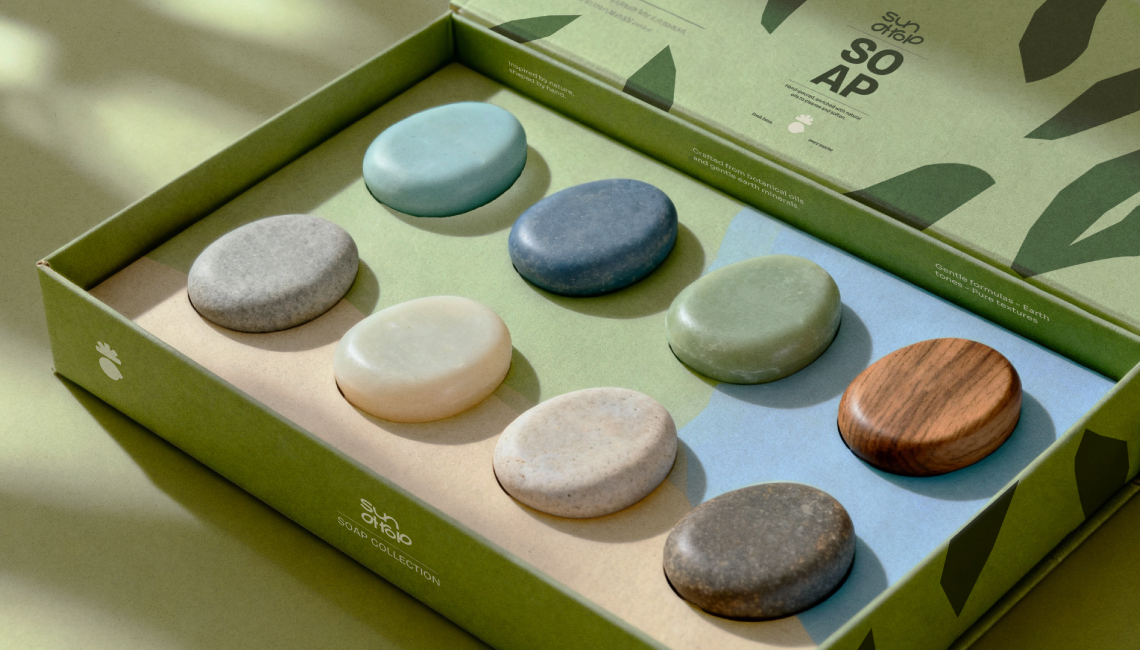
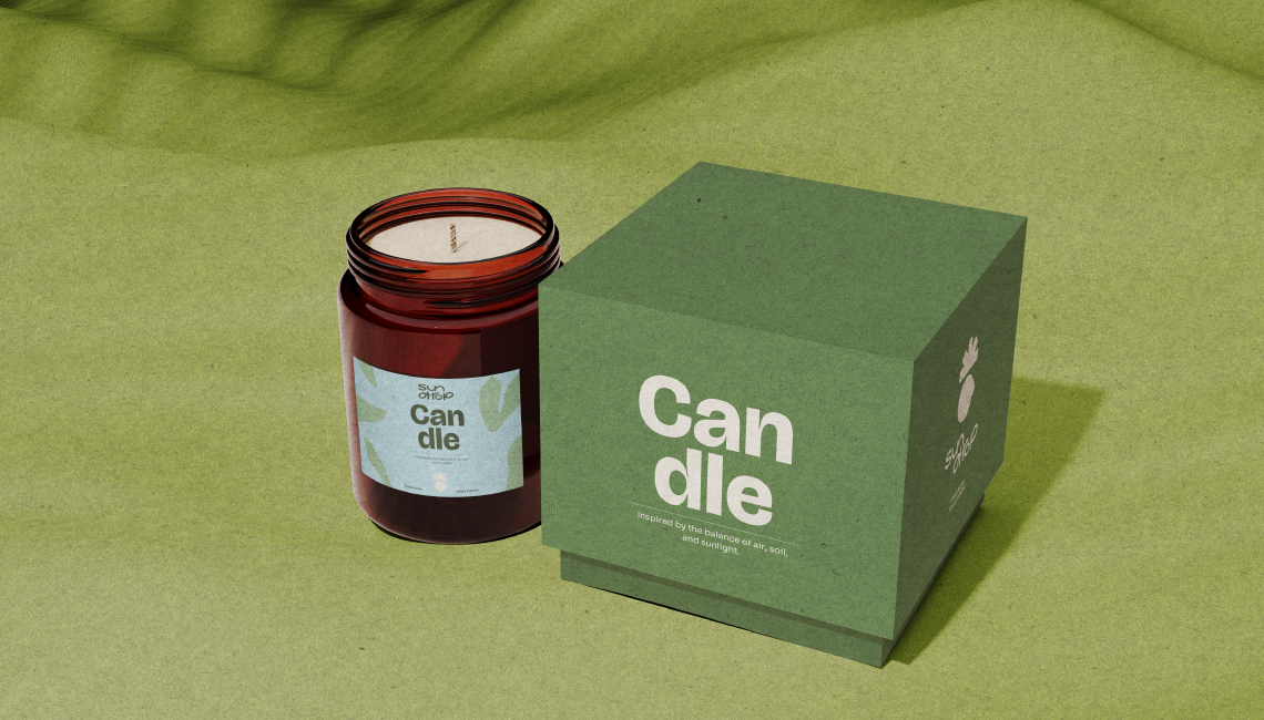
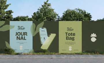
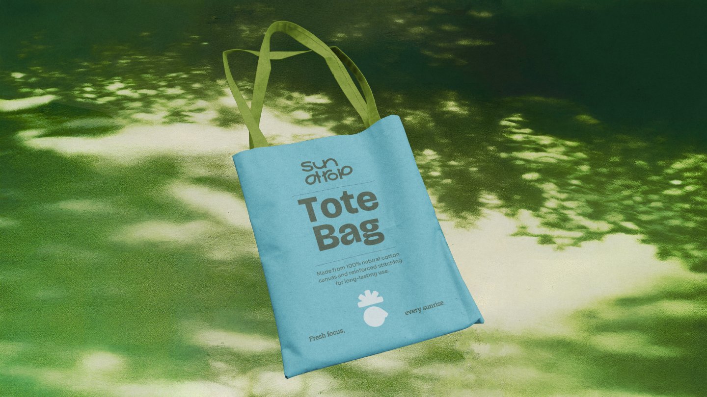
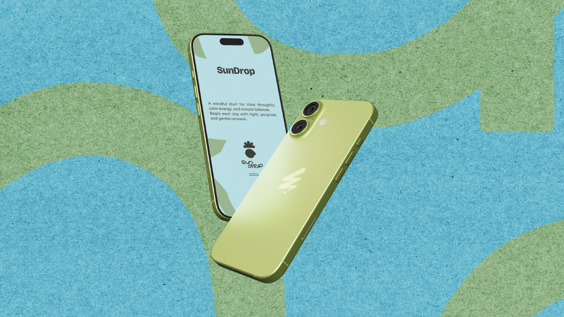
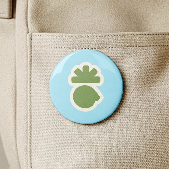
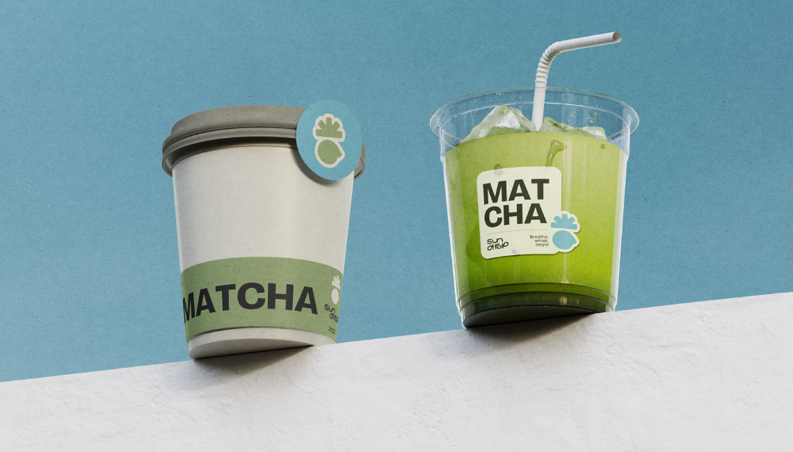
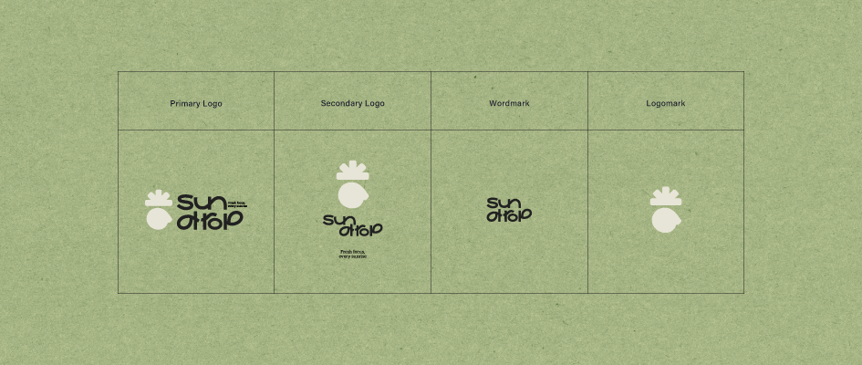
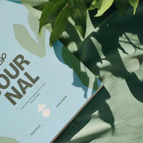
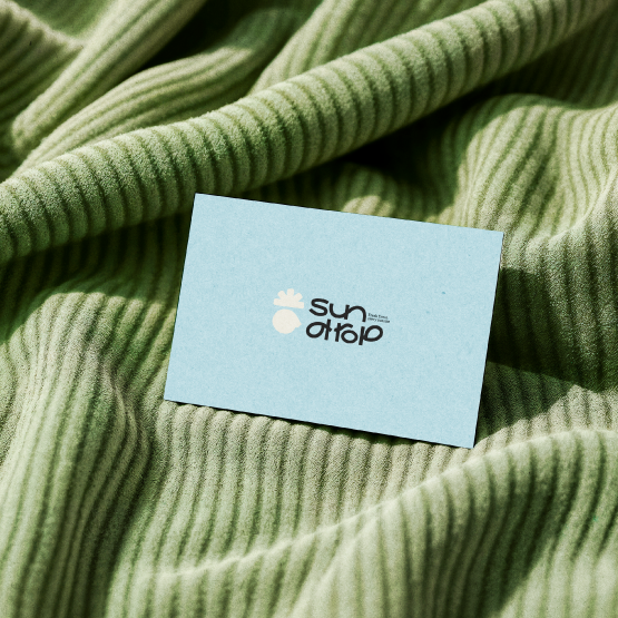
We built a visual identity centered around a sunburst-drop mark, fluid gradients, and clean typography. The palette leans into fresh, morning-inspired tones to evoke renewal and mental clarity. The design system scales seamlessly across the app’s features, from morning planning flows to mood-based task sorting, as well as across potential physical products like wellness journals, herbal teas, or eco-friendly goods. Every element supports the tagline: “Fresh focus, every sunrise."

SunDrop now stands as a bright, energizing brand that encourages daily clarity and positive momentum. The identity feels modern, calm, and refreshing a visual metaphor for beginning each day with intention. Whether applied to a productivity app, wellness tools, or sustainable products, SunDrop’s design system delivers a consistent sense of optimism and clarity.