Have you ever wondered how designers and artists come up with the perfect color combination for their work? There is a possibility that they draw inspiration from color theory.
Color theory is the study of how colors interact and which colors go well with each other. It’s a complex field that involves psychology, science, and art. This theory is based on the color wheel, which shows the relationships between the primary, secondary, and tertiary colors. It is also an important aspect of UI design, as it helps determine the color palette of a design, the impact of the colors used, and the overall aesthetic of the final product.
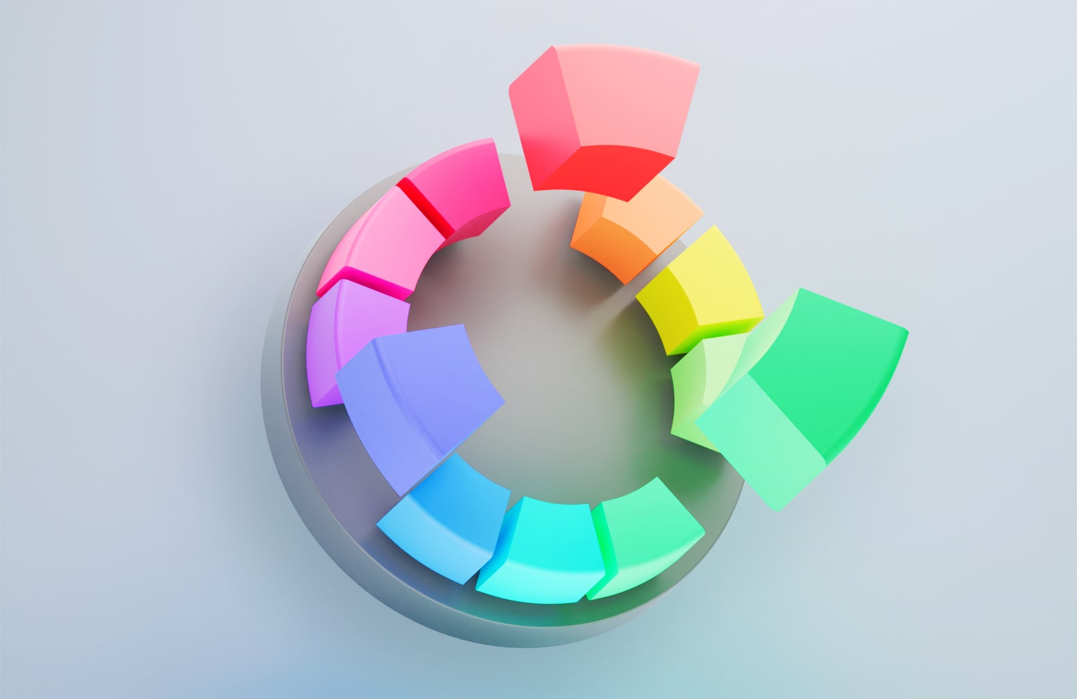
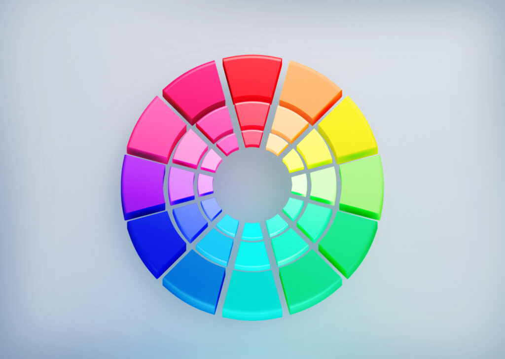
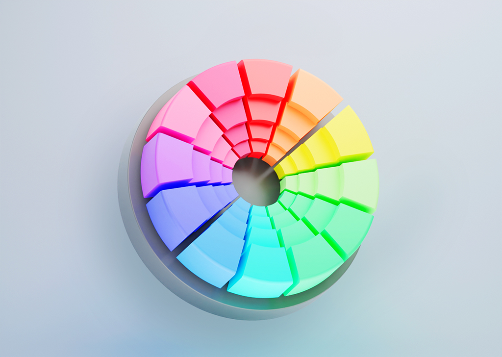
Color Wheel
The color wheel was invented in 1666 by Isaac Newton, who mapped the color spectrum onto a circle. It is the basis of color theory, and it offers a visual representation of the relationships between colors. The color wheel consists of 12 different colors, which include three primary colors, three secondary colors, and six tertiary colors. This wheel is a useful tool for artists and designers, as it helps visualize how colors are combined and how we can merge them to create a desirable visual effect.
Color wheels are classified into two types. Artists commonly use the RYB color wheel, which stands for red, yellow, and blue, to help in the mixing of paint colors. The RGB color wheel, or red, green, blue color wheel, is better for digital use because it involves mixing light as on a TV screen or computer.
Color Harmony
Color harmony is the use of certain color palettes in a design that creates a visually pleasing and balanced effect. Designers achieve this through the use of color combination rules. Some color schemes have proven to be more harmonious over time, and the following color combination rules are the most common ones that assist designers in creating a harmonious color palette for their work:
Monochromatic
A monochromatic color scheme is a color palette that consists of different shades, tones, and tints of a single hue. It includes one base color and its different intensities that create a range of tones. For example, a monochromatic blue combination would include shades of blue, such as navy blue, light blue, sky blue, and powder blue. This type of color scheme often exists in nature and is very calming to the eye.
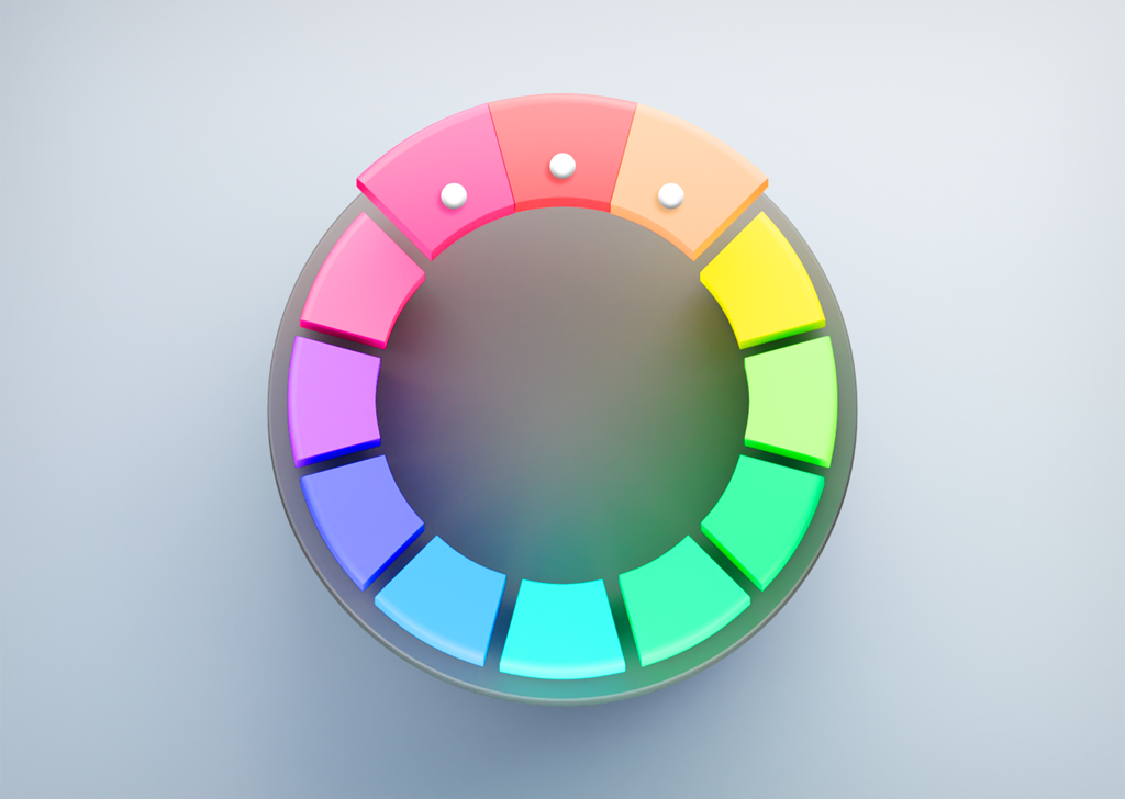
Analogous
An analogous color scheme in the color wheel is a grouping of 3 colors that are adjacent to each other on the color wheel. These colors usually share a common hue and create a harmonious and aesthetically satisfying combination. Choosing one dominant color and using the others as accents to balance an analogous color scheme is advisable.
Complementary
Complementary colors are any two colors that are directly opposite each other on the color wheel, such as blue and orange, red and green, or yellow and purple. These colors create a strong contrast, high visual interest, and a dynamic and vibrant atmosphere when used together.

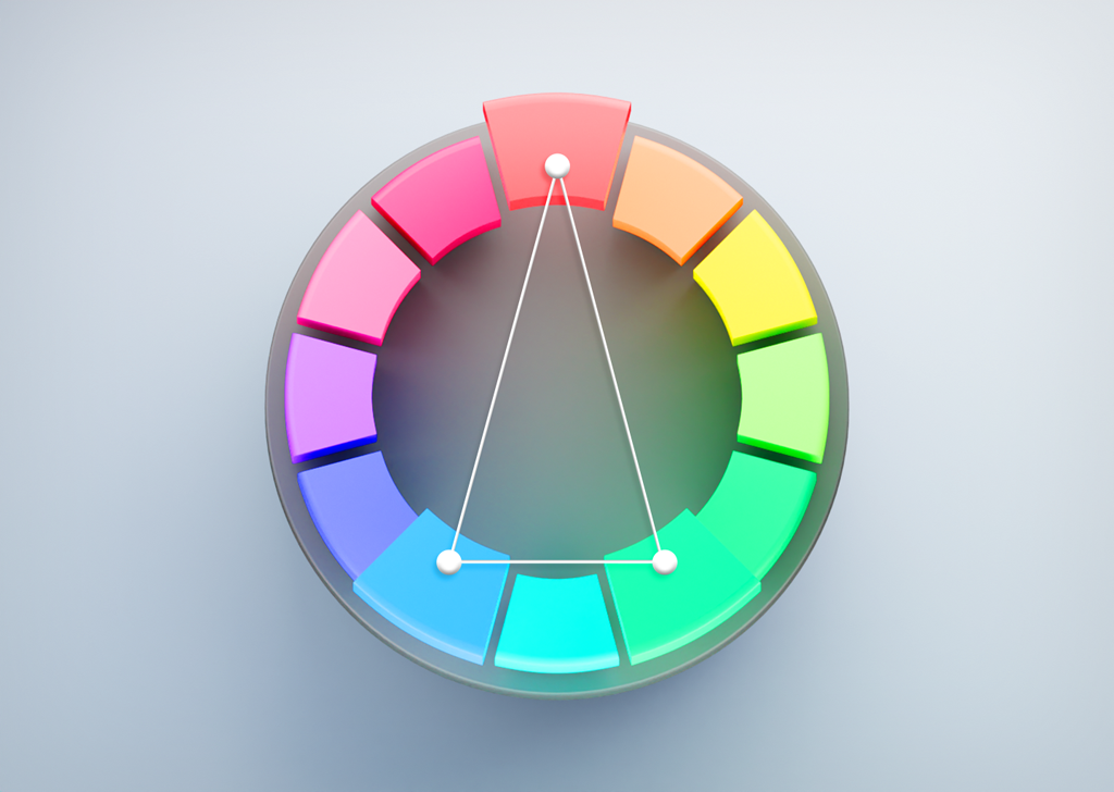
Split-Complementary
The split-complementary color scheme comprises three colors: a base color and two colors on either side of its complementary color. For example, red, blue-green, and yellow-green. The split-complementary color scheme provides a softer contrast compared to the complementary color scheme and has more space for balancing warm and cold colors.
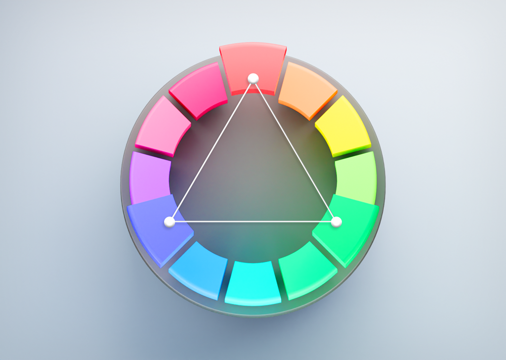
Triadic
Triadic color combinations are 3 colors that are evenly spaced around the color wheel. They tend to work best when one color is dominant and the other two colors perform the role of accents. This color scheme has a higher contrast than the complementary color combination, making it more versatile.
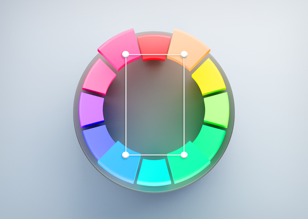
Tetradic
The tetradic color combination is a combination of four colors arranged in two complementary pairs forming a rectangle. This type of color combination contains two colors opposite each other on the color wheel. Tetradic color schemes are usually suitable for experienced designers and work best if you let one color be dominant, and use the others as accents.
Core Principles of Color Theory
Color categories:
a. Primary Colors
Primary colors are colors that can not be created by mixing other colors together. The three primary colors are red, blue, and yellow.
In the RGB color wheel, the primary colors are those that, when combined, produce pure white light. These are the colors red, green, and blue.
b. Secondary Colors
Secondary colors are colors that we create by mixing two primary colors. The three secondary colors are orange, green, and purple. We can create them by mixing two adjacent primary colors on the color wheel. For example, blue and yellow make green.
Secondary colors are yellow, magenta, and cyan In the RGB color wheel. With light included, green and blue produce cyan; blue and red produce magenta; and red and green create yellow.
c. Tertiary Colors
Tertiary colors are the colors that we can create by mixing a primary color with a secondary color. They are located in between the primary and secondary colors on the color wheel. Tertiary colors are red-orange, red-violet, yellow-orange, yellow-green, blue-green, and blue-violet.
In the RGB color wheel, there are six tertiary colors: orange, chartreuse green, spring green, azure, violet, and rose.
Color Systems:
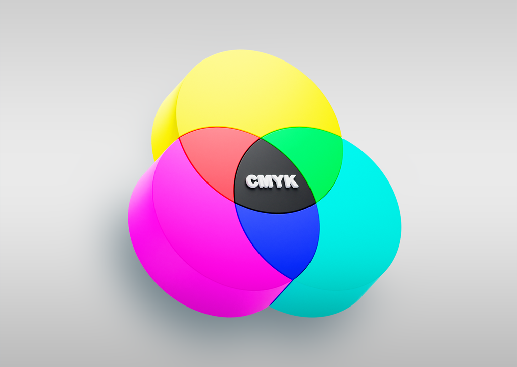
a. CMYK
The CMYK color system is a subtractive color model used in color printing. CMYK stands for Cyan, Magenta, Yellow, and Key (Black). The CMYK color system works by combining different levels of the four CMYK colors to create a range of colors that can be seen on paper. The colors are used in combination with a printing process called halftoning, which uses tiny dots of each color to create the illusion of a continuous-tone image.
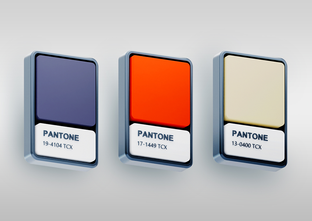
b. Pantone
The Pantone Color System is a standardized color reproduction system used in many industries, including printing, graphic design, and fashion design. It is widely used to ensure accurate color reproduction and consistency across different media. The system assigns each color a unique number and name, making it easier to obtain accurate color matches and ensure consistency throughout the design process.
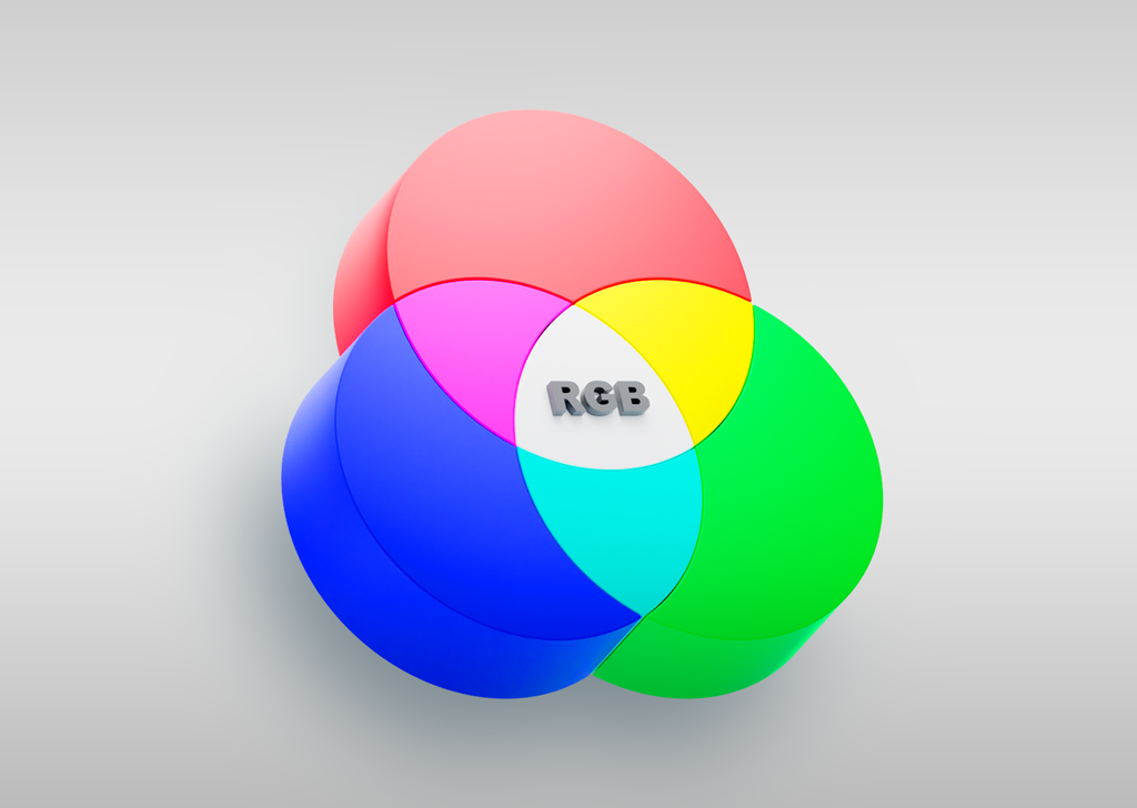
c. RGB
RGB stands for red, green, and blue. It is an additive color system in which red, green, and blue light are added together in various ways to create a wide array of colors. The RGB color system is used in digital images, television and computer monitors, and any other digital asset that employs light.
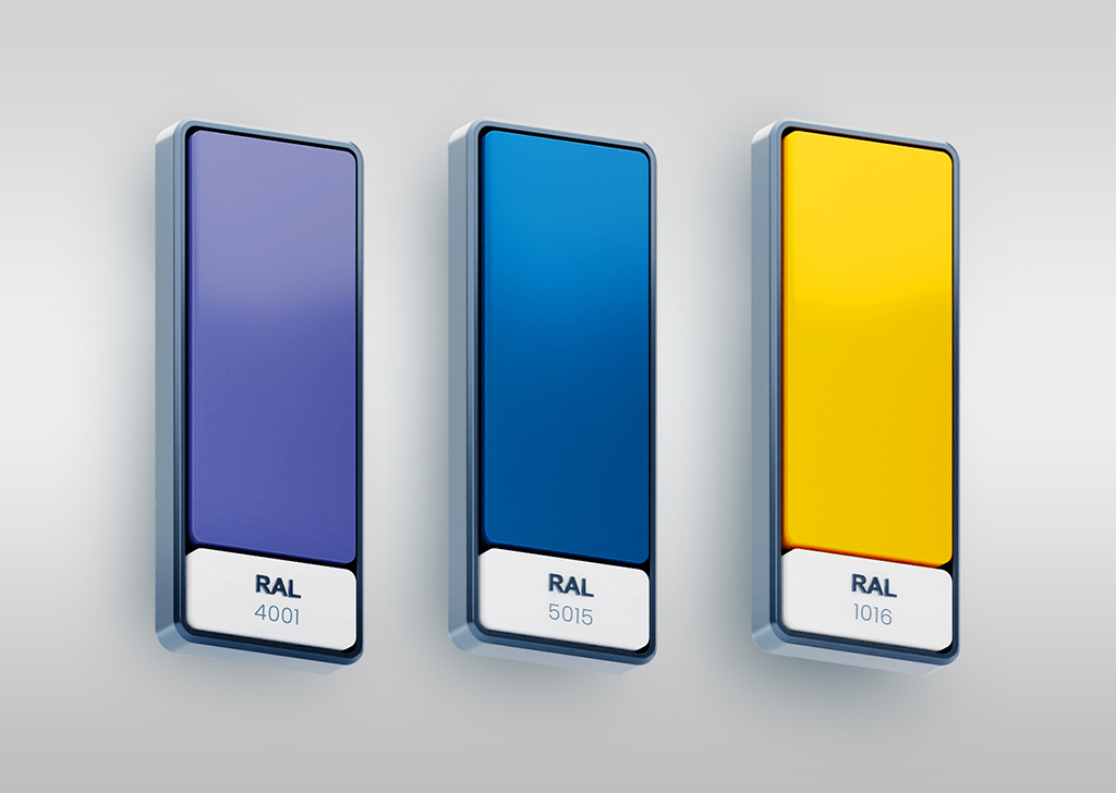
d. RAL
The RAL color system is a color-matching system used in Europe that consists of 216 standardized and pre-defined colors. The system is mainly used for varnish and powder coating but is also used for other applications such as artist paints, foam, and plastics. When designing physical products that require to be coated, this is the system to use.
HSV Color Model:
a. Hue
The name of any color that is in the color wheel is hue. Hue is the “purest” form of color and is usually the first thing people notice when looking at a color.
b. Saturation
Saturation is a term in color theory that stands for the intensity of a color. A color can be described as fully saturated when it is at its most intense and vibrant. The saturation of a color is often thought of on a scale from 0 to 100, with 0 being completely unsaturated (gray) and 100 being fully saturated.

c. Value
In color theory, value is the lightness or darkness of a color. Value is determined by how much black or white is added to a color, and it creates contrast and depth in an artwork or design.

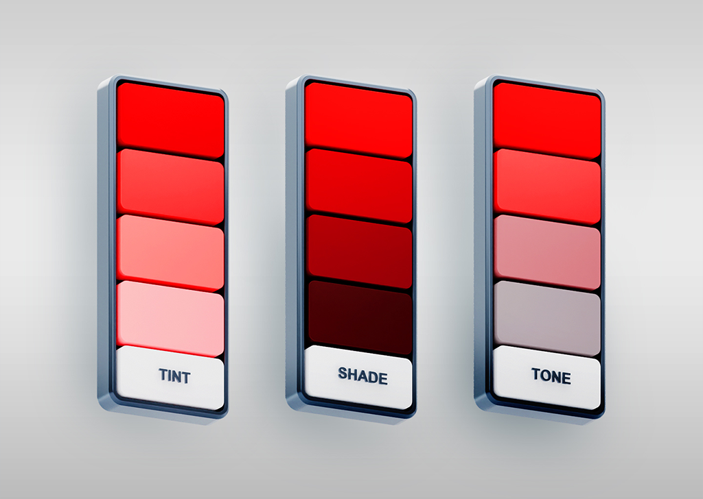
Tint, Shade, and Tone:
a. Tint
Tint is the addition of white to a base hue to lighten its value. Tints create lighter versions of existing colors or generate pastel colors.
b. Shade
In color theory, shade is a term that refers to a color that has black added to it, making it darker in hue. The color becomes darker with the shade, but the hue stays the same. This results in a deeper, richer color. Shades can be quite impactful and overwhelming.
c. Tone
The tone is created by mixing a base hue with gray. Adding gray to a color reduces its intensity significantly. Tones, like tints, are softer versions of the original color; however, tones are less likely to appear pastel and can reveal complexities that are not visible in the base color.
Color Temperature
Warm and cool colors are terms that describe the visual perception of color temperature. Warm colors include red, orange, and yellow, while cool colors include blue, green, and purple.
Colors that we associate with the sun and fire, such as red, orange, and yellow, are warm. These colors tend to evoke feelings of energy, warmth, and excitement. Cool colors are generally associated with water and sky, such as blue, green, and purple. These colors tend to evoke feelings of calmness, relaxation, and tranquility.
Understanding the concept of color temperature can help in making informed decisions when selecting color schemes for various spaces and purposes.
Principles of Color Application in UI Design
Consistency
Color consistency is particularly important because it helps users identify different elements and understand their hierarchy. For instance, if a button is always green, users will associate that color with an action, such as “submit” or “confirm.” If that color changes to blue or purple, users may become confused and unsure of what action to take.
Purposefulness
The selection and application of colors in UI design are not arbitrary, meaning that each color employed in the interface needs to serve a purpose or symbolize the brand identity. Various shades, tints, and tones of a color need to be used in a way that they can contribute to elaborating the relationship between various elements and degrees of hierarchy.
Distinctiveness
Contrast between text and background colors ensures that the text is legible and easy to read. Moreover, designers use contrast to highlight important elements and create visual interest. For example, a designer may choose to use a darker color for a call-to-action button to make it stand out on a light background.
Last Words
Color theory is an essential aspect of creating attractive and user-friendly interfaces. Understanding its core principles, such as the color wheel & its principles, allows designers to choose an effective color palette for their UI design based on the intended purpose and audience. By following these principles, designers can create interfaces that evoke desired emotions, guide users through the interface, and lead to higher conversion rates.