If you think design system is another fancy term in the world of digital design, then let me tell you that it’s more than that. A design system is a magical toolbox that can help you create incredible designs faster, more consistently, and with less effort.
Design systems are becoming increasingly popular in the world of programming and development. So, it is an essential tool for teams to create consistency and quality in their work. In this article, we’ll dive into the world of design systems, what they are, why they matter, and how you can create your own. So, let’s get started!
What Are Design Systems?
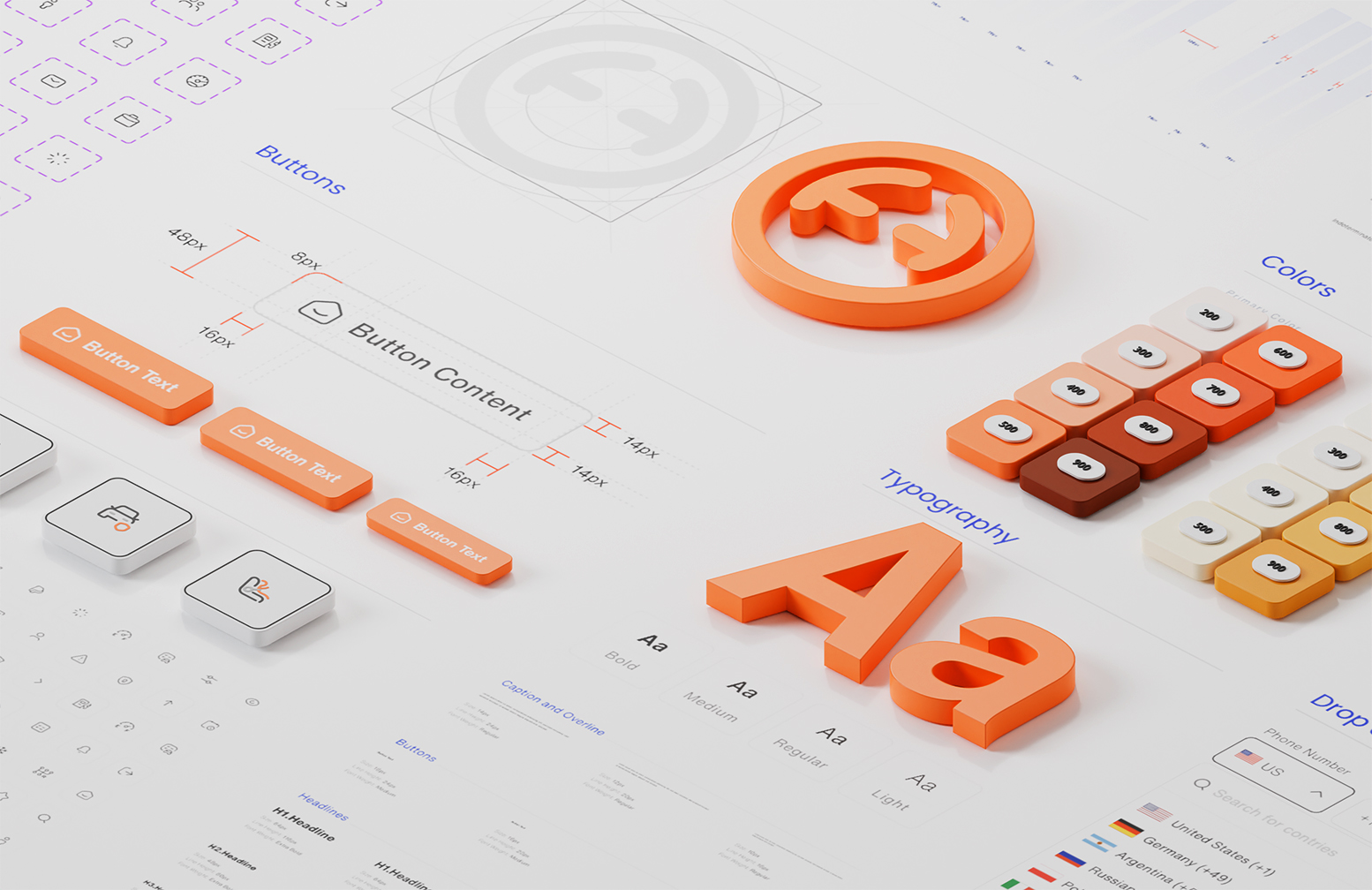
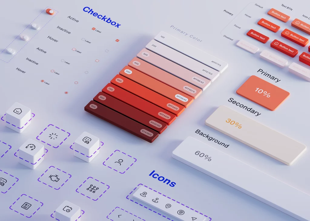
A design system is a collection of reusable components accompanied by guidelines for using them that enable designers and developers to create cohesive, consistent, and scalable digital products. It includes visual elements such as color palettes, buttons, typography, icons, and graphic styles. The guidelines contain rules that provide instructions on how to use and implement these visual elements in a way that would reflect the product’s design philosophy, such as simplicity, usability, and playfulness – whatever is unique to your brand or product. Design systems incorporate these components into teams and workflows to ensure consistent user experiences, even when a design is distributed among many designers and other creators.
What Are the Essential Elements of a Design System?
Well… We can answer this question in one sentence: It depends on the requirements of that particular design team. Every product, organization, or team has different needs and goals, so each design system can contain distinct elements. However, there are elements that exist in almost every design system. This is due to the fact that almost every application uses a similar set of components but is styled and built differently:
1. Style Guides
A style guide is a detailed document that sets out the rules and standards for creating, maintaining, and applying the visual identity and design elements of an organization or brand. It provides a comprehensive reference for designers and developers to ensure coherence in the appearance and behavior of every digital asset that represents the business, including website, app, prototype, and marketing collateral.
Typically, a style guide includes guidelines for the color palette, iconography, imagery, layout, interface elements, accessibility, and animation, among others. It helps to streamline the production process, improve UX and reduce rework.
Style guides typically exist in the form of a document. They can be a section of an intranet, but they are frequently presented as PDFs or other static media. However, this may make editing difficult and raise issues with document management.
2. Component Library
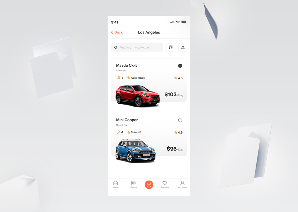
A component library is a collection of pre-designed and usability-tested UI elements plus code that can be assembled and reused. It provides a set of well-documented, tested, and modular building blocks that designers can easily customize and share with other designers and developers.
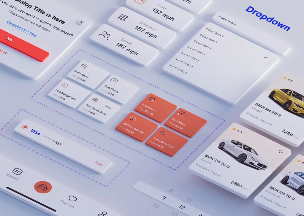
A component library often includes components for typography, colors, buttons, forms, navigation, icons, modals, and other common UI patterns used in web and mobile applications. Such a library acts as a bridge between developers and designers, and creating one takes significant time and resources.
Design System vs. UI Kit
A design system and a UI Kit are related concepts, but they serve different purposes in the design process.
A UI kit, as the name suggests, focuses solely on the user interface. It is a collection of templated pages as well as predefined interface components such as buttons, progress bars, and other navigational elements. Designers can quickly put wireframes and pages together using a UI kit, but they are limited to these UI features. It’s also not a ‘living’ kit like a design system, necessitating more manual work.
A UI kit is an ideal choice for creating internal prototypes or purely visual designs. A design system, on the other hand, is necessary if you want something that works on a larger scale and for both designers and developers.
When are Design Systems Used?
Design systems are typically used in product design, website design, and digital marketing. They are especially useful for large organizations with multiple teams and products because they provide a standardized way of working across different platforms and projects. Additionally, agencies, startups, and freelancers who work on a variety of projects can benefit from design systems as they help to streamline the design process.
What are the Benefits of having a Design System?
1. Consistency
A design system can help maintain consistency and coherence across all aspects of a project or product, from colors and typography to button styles and iconography.
2. Efficiency
Design systems can make the design process more efficient. After establishing a design system, designers can use predefined styles and components, rather than having to create them from scratch each time they start a new project, which also means enormous time saving.
3. Scalability
A design system can be adapted to the product or project in terms of scale. As the product or project expands, the design system can be easily updated and reused across different platforms.
4. Collaboration
A design system can enhance collaboration among different teams, such as designers, developers, and customers. Everyone can work from the same set of design guidelines and understand the reasoning behind design decisions.
5. Brand identity
A design system can help establish and reinforce brand identity. By consistently using the same colors, typography, and imagery across all products and platforms, the brand will be more easily recognizable.
How Is Design System Inspired by Brad Frost’s Atomic Design?
Brad Frost’s Atomic Design methodology is a system for creating and maintaining design systems in a structured manner. The idea behind Atomic Design is to think of user interfaces as a combination of smaller building blocks that can be combined and reused across different parts of products. The methodology is “Atomic” because it starts with the smallest and simplest building blocks (atoms) and builds them up into more complex molecules and eventually complete organisms.
The five levels in Atomic Design are:
1. Atoms
The smallest and simplest building blocks of a user interface. Examples of atoms include buttons, text fields, labels, and icons.
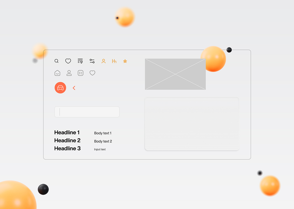
2. Molecules
A combination of two or more atoms that form a unit. For example, the combination of a text box and a button makes a search box molecule.
3. Organisms
A combination of multiple molecules that form a larger and more functional section of a UI. Examples of organisms include a header section or a content block.
4. Templates
A specific layout or structure that defines the position and relationship of organisms on a page. Templates provide consistency to the overall design of a website or application.
5. Pages
The final stage is where templates are filled with specific content to create a complete web page or application screen.
How Can a Design System Be Created?
Creating a design system from scratch is not necessarily everyone’s cup of tea and requires particular skills. However, if your team decides to create one, here are the steps you may need to follow:
1. Define your brand
Before you start creating a design system, you need to have a clear understanding of your brand’s and your team’s mission, values, and goals. Your design system should reflect and reinforce these aspects of your brand.
2. Conduct research
Research is a crucial step in creating a design system. It involves gathering information about the target audience, the industry, the competition, and any other relevant factors that may impact the design system. Create personas and user journeys to guide your design decisions.
3. Establish guidelines
Use tools like Figma, Sketch, or Adobe XD to create a style guide that defines your design system’s visual language. This may include typography, color palettes, iconography, and layout principles. Consider using a design system management tool like Storybook and Zeroheight to help manage and share your design system with your team.
4. Create components
With guidelines established, start creating components for the design system. Use your design tool to create reusable design components, like buttons, forms, and navigation menus. Keep in mind the principles you’ve established in your style guide and aim for consistency across all components.
6. Document the system
A design system is only effective if it is well-documented and easy to use. You should create clear and concise documentation that explains how to use your design system, including guidelines for developers, designers, and other stakeholders.
7. Iterate and evolve
After creating components, test them to ensure they work as intended and meet user needs. Iterate as needed to refine the design and improve usability. Use tools like InVision, Figma, or Marvel to prototype and test your design system with real users. Gather feedback and iterate on your components and guidelines as needed.
A design system is not a static entity. It should evolve over time as your brand and products change and as new technologies and design trends emerge. Therefore, you should establish a process for reviewing and updating your design system regularly.
Tools for Creating a Design System
1. Figma
It is a cloud-based digital design tool that enables designers and teams to collaborate on design projects in real-time. Figma allows designers to create interactive and high-fidelity prototypes of their designs, which can be tested and validated by users.
2. Sketch
Sketch is a vector-based digital design tool that helps create user interfaces, mobile apps, websites, and other digital products. It is widely used in the design industry and has become a popular alternative to Adobe Photoshop and Illustrator for digital product design.
3. InVision App
InVision App is a digital product design platform that offers a suite of tools to help designers and teams create, share, and collaborate on design projects. It is widely used in the design industry for its prototyping, collaboration, and design management capabilities.
4. Adobe XD
Adobe XD allows designers to create wireframes, high-fidelity designs, and interactive prototypes in a single application. It is available on both Windows and Mac operating systems and can act as a standalone application or be integrated with other Adobe Creative Cloud applications such as Photoshop, Illustrator, and After Effects.
Creating Your Own Design System Isn’t Always a Good Idea
Creating a design system is not practical for all teams, and it can have cons as well as pros.
What are its cons?
- It can be a time-consuming process, requiring significant upfront investment in research, design, and testing.
- It can sometimes limit creativity, as designers may feel constrained by pre-established rules and guidelines.
- It requires ongoing maintenance and updates to remain relevant and effective.
- Creating a design system can involve significant costs, especially for small businesses or startups.
- It may take time for some team members to adopt a new design system, which can cause friction and delay in implementation.
- the design library and the production code may be conflicting. When discrepancies arise between design and code components, it leads to a misalignment between what is intended in the design and what is actually implemented. Managing and synchronizing two separate sources of truth requires double effort.
As a result, creating a new design system from scratch is not everyone’s cup of tea. So, before embarking on the creation of one, teams must weigh its benefits and drawbacks for the company.
Some Popular Design Systems
As you probably already know, many major companies have created their own design systems and made them available to everyone. To name the best-known:
1. Material Design by Google
At its core, Material Design is based on the idea of digital material. It uses a metaphor of paper and ink to create a hierarchy of layers, where each layer represents a different level of importance or interaction. For example, a button might be a raised layer on top of a flat background, indicating that it is a more important element than the background.
2. Carbon Design by IBM
Carbon Design System is a design system developed by IBM that provides a set of guidelines, tools, and resources for designing and developing digital products and experiences that are consistent with IBM’s brand identity. The system is open-source, which means that anyone can access and use its resources for free.
3. Polaris by Shopify
Polaris is based on a set of design principles that focus on clarity, simplicity, and accessibility. It provides designers and developers with a library of UI components, such as buttons, forms, typography, and icons, that work together seamlessly to meet the needs of a wide range of use cases. This can be particularly useful for developers who are building apps for the Shopify platform and need to ensure that their app’s interface is consistent with the rest of the Shopify ecosystem.
4. ADG by Atlassian
Atlassian Design Guidelines (ADG) is a design system developed by Atlassian, the company behind popular software tools such as Jira, Confluence, and Trello. ADG includes guidelines for writing copy, designing layouts, and creating interactions. In addition, ADG provides a set of design tools and resources, such as Sketch files, React components, and documentation, that can help designers and developers work more efficiently and collaboratively.
Long Story Short
By providing a comprehensive set of guidelines, principles, and assets, design systems streamline the design process and improve collaboration among cross-functional teams. However, implementing a design system requires a significant amount of effort and resources, and it’s important to approach it as an ongoing process rather than a one-time project. By continually refining and updating the design system, teams can ensure that it stays relevant and effective in meeting the evolving needs of users and the business. Ultimately leading to more successful business outcomes.