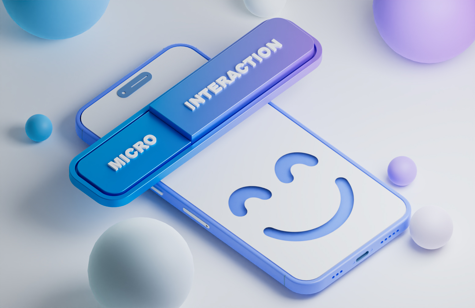
Every new experience is a bit of a challenge. Remember your first day at your new job? Or your first car-driving experience? How about your very first encounter with a new product or application in the digital world? Then you are probably familiar with that initial feeling of confusion after downloading an application or visiting a website for the first time. This feeling leaves you unsure of what steps to take or how to operate that product. So what should service providers and app designers do to make that first experience easier for their users? Well, this is where the user onboarding becomes relevant.
What Is User Onboarding in UX Design?
In user-experience design, user onboarding refers to all the introductory patterns and techniques employed in the product design to help the user understand the product and its features and functions. These elements are particularly designed for newcomers and usually appear at the initial stage of running an application/visiting a website and are followed by what is called an “aha! moment” for the user. The onboarding process typically includes providing the user with tutorials, walkthroughs, and other resources that help them understand the product.
Additionally, user onboarding can involve providing incentives and rewards to encourage the user to keep using the product. By providing such a positive onboarding experience, companies can increase user engagement.
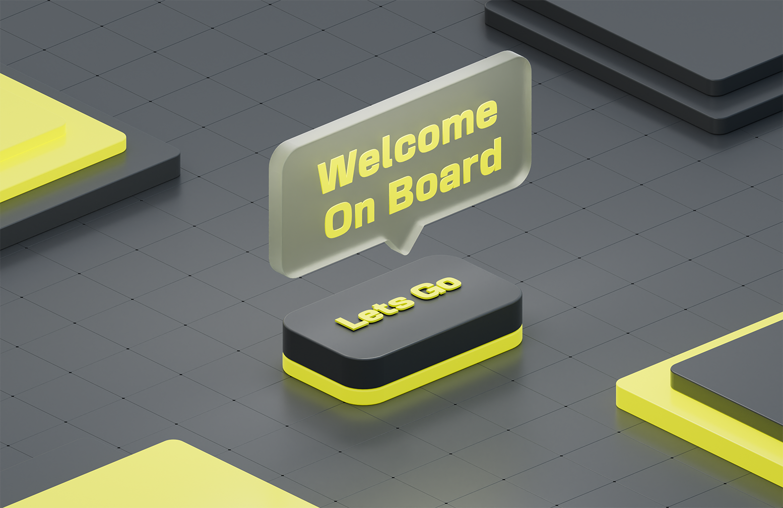
The purpose of onboarding design is simply to greet its first-time users and create an emotional bond. In addition, it introduces updates, new features, and services that users are most probably unaware of. That is why an onboarding pattern needs to be engaging and brief in a way that appeals to the users and encourages product retention and conversion.
7 Most Common User Onboarding Patterns
There are several techniques that UI/UX specialists employ to design onboarding patterns. Here is a list of the most commonly used onboarding patterns that have proved to encourage product retention:
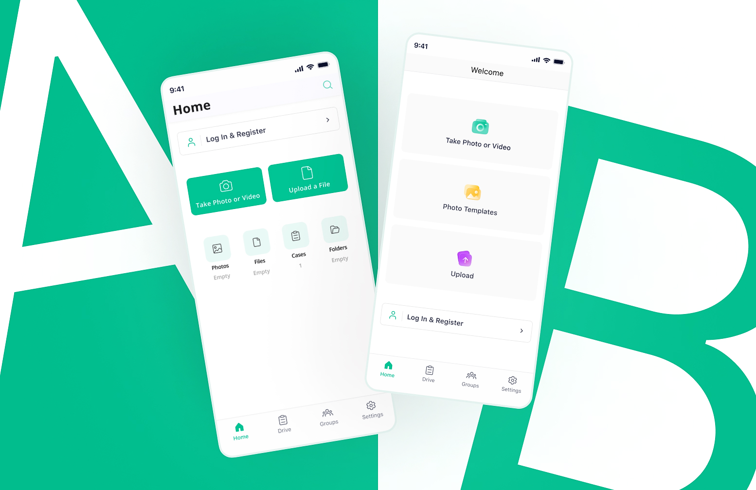
1. Onboarding Tour
“Onboarding tour” is the guided tour of a website and application or a product walkthrough that helps new users become familiar with the features and functions of the product. It typically includes a series of steps or slides that introduce users to the product, explain how to use it, and provide helpful tips and resources. Designers often use onboarding tours to help users quickly become comfortable with a product and increase their engagement with it.
The screens that show up at the start of a mobile application with appealing designs, animations, and short introductory notes under them that reflect the overall spirit of the product are examples of onboarding tours.
A tour can also serve as a guide to various layout components, app features, and interactive elements that are activated following a product update or a new launch.
It is advisable to add a skip button to the corner for users who are already familiar with the product or are willing to explore the features on their own. If you want to leave a strong first impression, this is where you can showcase the value and prestige of your product.
2. Customized Onboarding
The idea of creating a personalized environment in the virtual world appeals to most users. That is why it is a good idea to allow them to adjust the service based on their own preferences.
Apps that require users to sign up and give consent usually use this type of user onboarding. By asking their new users a couple of questions (preferably no more than 5) about their job, age, field of study, or any other information that enables self-segmentation, they increase the relevance of the first experience for users.
The factor that separates customized onboarding from an onboarding tour is that it provides users with the opportunity to make their own choices while getting more familiar with the product, resulting in a more personalized onboarding experience.
Several popular brands such as Pinterest set the preferences of their users from the very start. They make suggestions to their new users based on their age, gender, country, and most importantly, their own preferences.
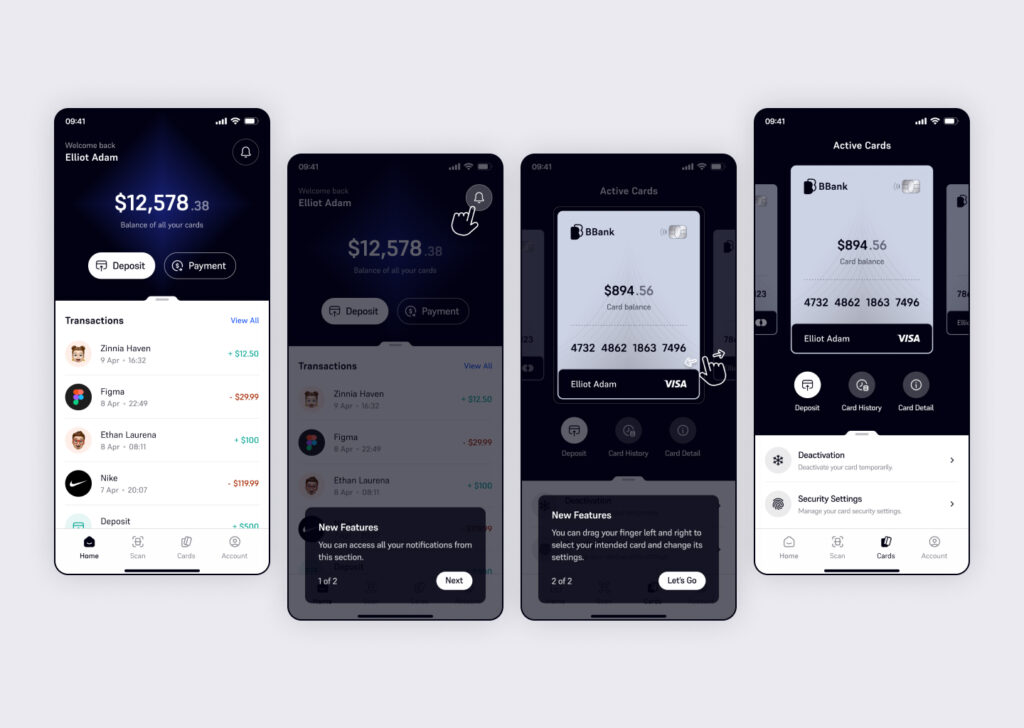
3. Checklists and Progress Indicators
Checklists and progress bars are UI elements that demonstrate the steps that must be taken by the user and once an action is fully completed, a tick is added in front of the accomplished task. They can also show users what stage they are at and how much progress they have made so far in the onboarding process. They are commonly accompanied by a final applauding message, which is a perfect incentive for users to retain the product.
This type of onboarding draws on the natural human instinct to encourage them to accomplish a task. Leaving a task unfinished tends to prey on our minds for a long time. Therefore, we all feel that urge within ourselves to complete a task, followed by a comforting feeling of satisfaction.
Designers who are aware of user psychology employ this method to 1) break the task into smaller steps, making it more manageable for the new users 2) motivate users to finish a task 3) create a feeling of satisfaction and achievement from the very beginning.
4. Tooltips
These are brief hints that show up when your cursor hovers over an app feature or a website component for the first time. They may also be triggered if the user ignores a feature for a specific period of time, shows signs of confusion and hesitation during a product launch, or needs to be informed of a new update has been made to the app.
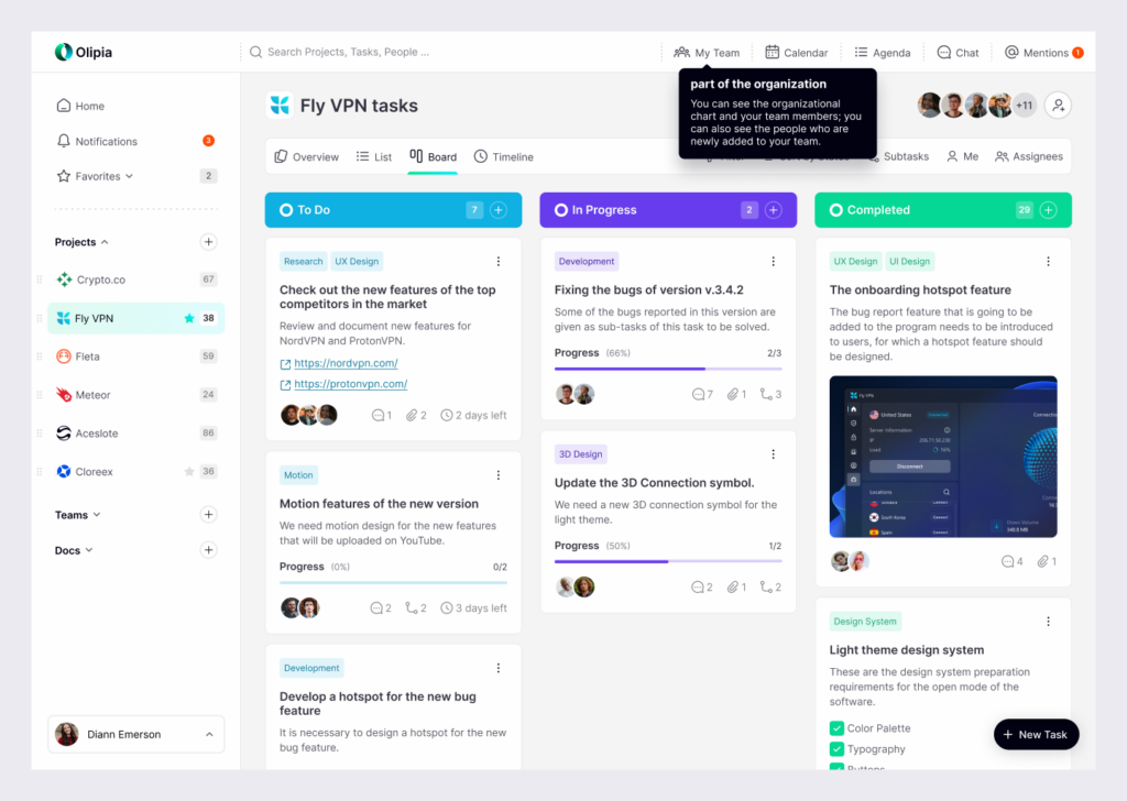
It is very important to set the timing and location of these tooltips right in order to avoid frustration and confusion among users. Also, it is always considered a merit to offer a “skip the tutorial” option to your users because not everybody does favor tooltips and they sometimes run the risk of looking spammy.
5. Hotspots
This onboarding pattern highlights some unused features and prevents them from going unnoticed by inexperienced users. Hotspots are designed using noticeable colors, animated icons, or blinking dots; they provide alerts without distracting their users.
Unlike tooltips, hotspots are optional onboarding elements, meaning that while they grab the attention of their users, it is the users’ call to explore or disregard them (I must confess, though, that they always trigger my curiosity!).
Using a hotspot next to premium features attracts user attention to them. This draws attention to paid features and highlights what users are missing out on. After clicking on the feature with the beacon, the coloring around the hotspot fades, which clears up the UX clutter.
6. Onboarding Video
This onboarding technique gives a quick overview of the product and provides a visual tutorial. This method is better for users who would prefer watching a short video at the start to being constantly interrupted by tooltips and pop-ups. These videos are usually triggered when a new user signs up or ignores a feature for a long time.
91% of people have watched a video to understand how to use a product better.
97% of people think that video is an effective tool to welcome and educate new customers.
Before making a video, you need to specify your goal. For instance, do you aim at promoting your product or solely educating your users?
Dos and Don’ts of User Onboarding
So far, we have discussed how important a role user onboarding plays in optimizing the initial user experience and creating a strong first impression. However, there are some critical factors to consider when designing your onboarding UX.
Dos
- Discover the thought processes of your potential customers through user research and usability testing to organize onboarding properly.
- Design a mascot if it suits the essence of your product. A mascot is a character that simulates the flow of real-life communication with users and creates an emotional bond with them.
- Take the needs of your users into consideration. In other words, you’d better address the pain points of your users. Focusing solely on promoting your product can have a negative effect.
- Provide your users with the skipping option. No good can come from forcing someone to watch/read directions, and it might result in user churn.
Don’ts
- Less is always more. That’s why you’d better offer information in a clear and time-saving manner and not provide an overwhelming amount of information at the onboarding stage.
- Don’t overlook the demands of users by merely focusing on promoting your product. Users need to trust you if they’re gonna retain your product.
- Don’t bother your previous users with repetitive information that they already know.
To Sum up
Since a lot of effort and investment goes into a product, it will be a huge disappointment if it doesn’t achieve the success that is anticipated. Therefore, user onboarding is something that all designers, programmers, and companies must take into account.
Additionally, knowledge of user psychology will enable you to empathize with users, predict their behavior accurately and provide the onboarding process that has proved to be the most efficient and intuitive one for your audience.
In such an intense and competitive market, user onboarding can help your product reach new heights or make it go downhill. The choice is yours!