When a potential customer visits your website, they decide in seconds whether your brand feels trustworthy, credible, and worth their time. Yet every day, thousands of businesses debate a familiar question:
“Should we invest in custom web design, or just use a template?”
At first glance, a template might seem cheaper, faster, and good enough. But for companies serious about long-term growth, digital branding and creative design, and customer trust, custom web design and development are often the smart investment that pays for itself many times over.
In this post, we’ll break down exactly how custom web design enhances brand identity, address the most common questions companies ask, and share insights that may surprise you. So, if you’re wondering whether your business should invest in custom web design, you’re in the right place.
Reflecting Your Brand Identity: Why Does It Matter?
Studies show that users form an opinion in just 0.05 seconds. This snap judgment shapes their willingness to engage with or leave your website. That said, to attract and keep users, a website should reflect your brand identity.
Your brand identity is how your customers perceive you. It includes:
- Your logo
- Color schemes
- Fonts
- Voice and messaging
- Imagery and design style
- Your values, tone, and customer experience
And if you’ve got a strong brand identity, that means your brand can build trust, loyalty, recognition, competitive differentiation, and pricing power. However, here’s the catch:
Your website is where your brand identity is shown to the public, and for that same reason, a generic website cannot reflect you as a brand or connect with your audience. As a result, you will lose ground no matter how great your product or service is.
The Drawbacks of Template Designs
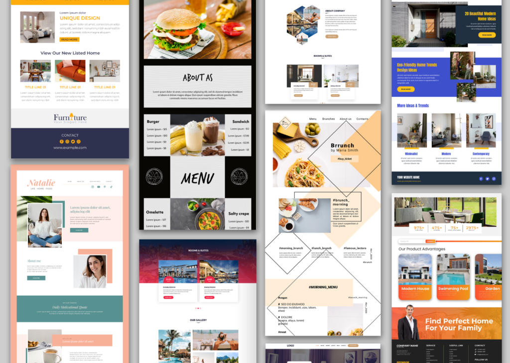
Website templates absolutely have a place, especially for small startups or personal projects. They offer lower upfront costs, fast deployment, and basic functionality.
In the beginning, that can feel like enough. But growing brands soon realize the drawbacks, particularly when trying to compete at a higher level or support more sophisticated digital strategies like mobile-first website development or custom UX/UI design services. Here’s where templates often fall short for scaling businesses:
| Problem | Impact on Brand |
|---|---|
| Generic look and feel | Harder to stand out in saturated markets |
| Limited customization | Can’t fully reflect your brand identity |
| Restricted functionality | May block critical features you need |
| Performance issues | Slower load time that hurts SEO and user experience |
| Scalability limits | Harder to change or revise as your business grows |
| Security risks | More vulnerable to attacks if plugins are outdated |
Templates can get you online, but they rarely help you lead. More importantly, they are not suitable for UI accessibility design standards, web animation development techniques, or API integrations for web platforms. Custom solutions, on the other hand, provide flexibility and give you the tools you need for a tailored look. This means your website can evolve with your business, and the design will not hold it back.
What Makes Custom Web Design So Effective for Brand Identity?
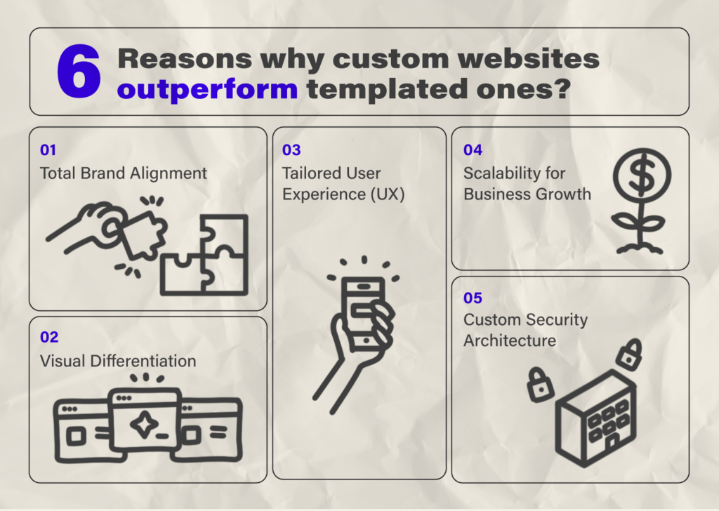
To answer this question, let’s break down six reasons why custom websites outperform templated ones in brand building and user experience:
Total Brand Alignment
With custom design, we mean everything that is customized for your brand, your name, and your business. Every element is designed to reflect your brand personality in the best way possible. Our custom web design does not give a website with your brand colors and logo on it. Our primary goal is to inject how your brand feels into the design. In doing so, we ask ourselves questions like: Is your brand playful? Serious? Luxury-focused? Future-minded? Who are you speaking to? Gen Z, executives, global markets?
At Abron, we design interfaces that answer those questions without words. A well-crafted dashboard, or even a simple content page, can tell your audience: “This was made for you.” And when that feeling shows up across every screen and interaction, your brand feels consistent and alive.
Visual Differentiation
If your site looks like everyone else’s, it fades into the background. But when it feels different, people remember. That visual contrast brings in a branding advantage that would keep you ahead of your competitors.
We make use of:
- Clean, thoughtful animations that add polish
- Custom icons and illustrations that speak your tone
- Visual styles like color gradients or dark mode themes that add personality and mood
These become the visual signals that you’re not like the rest.
Tailored User Experience (UX)
A custom web design helps deliver a tailored user experience by focusing on your specific audience’s needs, behaviors, and preferences. It allows for intuitive navigation, faster load times, mobile responsiveness, and a clear user journey. It gives you the freedom to design how users move through it. You can benefit from Abron Studio’s custom design services if you are looking to have a natural and easy-to-navigate flow on your website.
Enhanced Performance and SEO
Custom builds are lighter, faster, and easier to optimize. Custom design enhances performance and SEO by enabling developers to create streamlined, efficient code tailored to a website’s specific functionality and user experience needs. In web design, we always underline the importance of load time as a critical factor for both user satisfaction and search engine rankings. Unlike template-based designs, custom websites help us achieve faster load times by avoiding unnecessary features. Additionally, developers can implement SEO best practices directly into the site’s structure, including optimized metadata, semantic HTML, responsive design, and clean URLs. These contribute to better crawlability, improved indexing by search engines, and higher visibility in search results, ultimately driving more organic traffic and ensuring long-term scalability.
In sum, all of this makes your website easier to find, faster to use, and much more future-proof as your needs grow.
Scalability for Business Growth
Your website shouldn’t hold you back when your business evolves. With custom architecture and modular design, we can build a site that’s flexible, expandable, and ready for what’s next. This means that by getting a custom design, you can integrate new tools, add eCommerce, launch gated content, and any other feature you might think of.
Custom Security Architecture
Custom security architecture ensures your website is secure by design, not as an afterthought. By building from the ground up, you maintain full control over the technology stack, reducing reliance on third-party plugins and minimizing exposure to external vulnerabilities. This level of control is essential in sectors like healthcare, fintech, and SaaS, where strict compliance with standards such as HIPAA and GDPR is mandatory. It also enables seamless integration of accessibility requirements, supporting inclusive and equitable user experiences. Prioritizing security at every level not only safeguards data but also reinforces user trust as a core element of your brand.
Three Custom Design Examples From Abron Studio
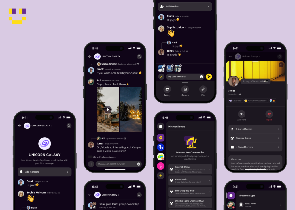
Pepchat
Pepchat is a social messaging app targeting peptide research communities. We’ve designed an organized flow through which users can invite friends to servers, channels, and groups. Since the app targets IOS users, in designing it, we followed IOS design guidelines. These include centered alignment for the copy and rounded icons.
Kept
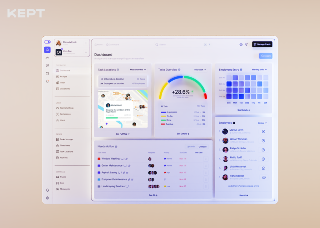
Kept is a task management platform. What makes Kept different is its friendly style and clean organization. The custom icons add to the softness of the brand identity, complemented by a sans-serif typeface. The home section includes the latest tasks with four task categories. It features intuitive details, including two task models (Checklists and Progressive Tasks), priority flags, advanced sorting options, and four dynamic user panels.
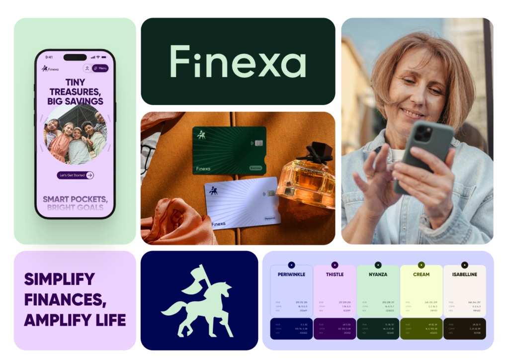
Finexa
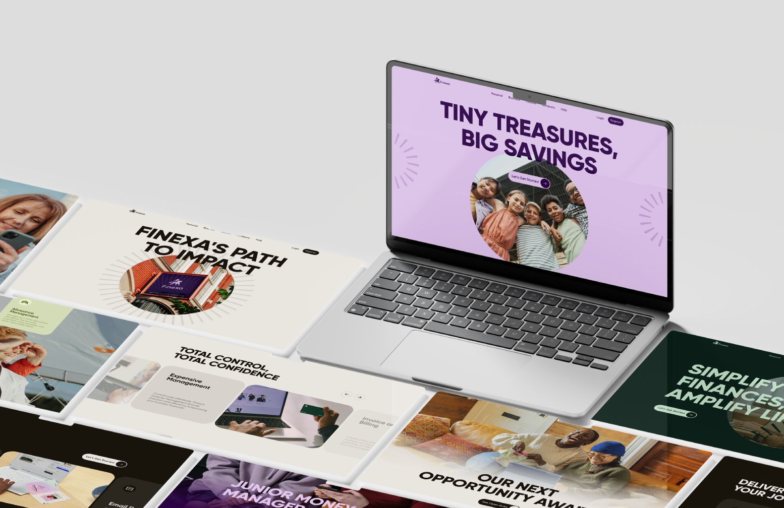
Circular shapes and motion go through our custom UI/UX for Finexa. Through animated icons, dynamic patterns, and fluid layouts, we convey a closeness between Finexa and its users. Alongside the clean information architecture, the candid imagery reflects the brand’s people-first philosophy and adds to this UI’s inviting appearance.
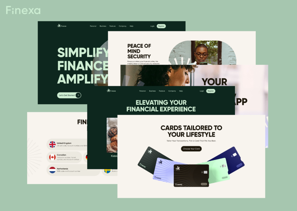
Finexa was a comprehensive project that required various UI pages for its audience groups. Let’s compare the variety in look for our junior and business UIs:
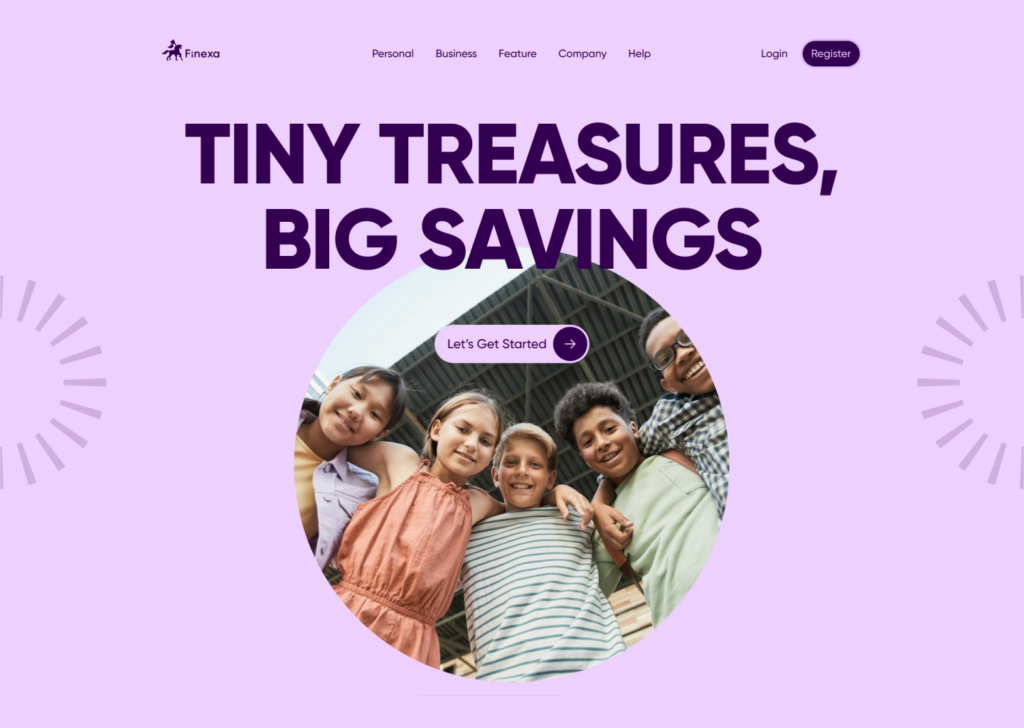
As we scroll through Finexa’s junior page, we awaken an elegant choreography of interactions. This rejuvenating space showcases Finexa’s services for junior users to explore the world of finance and learn saving alongside playing.
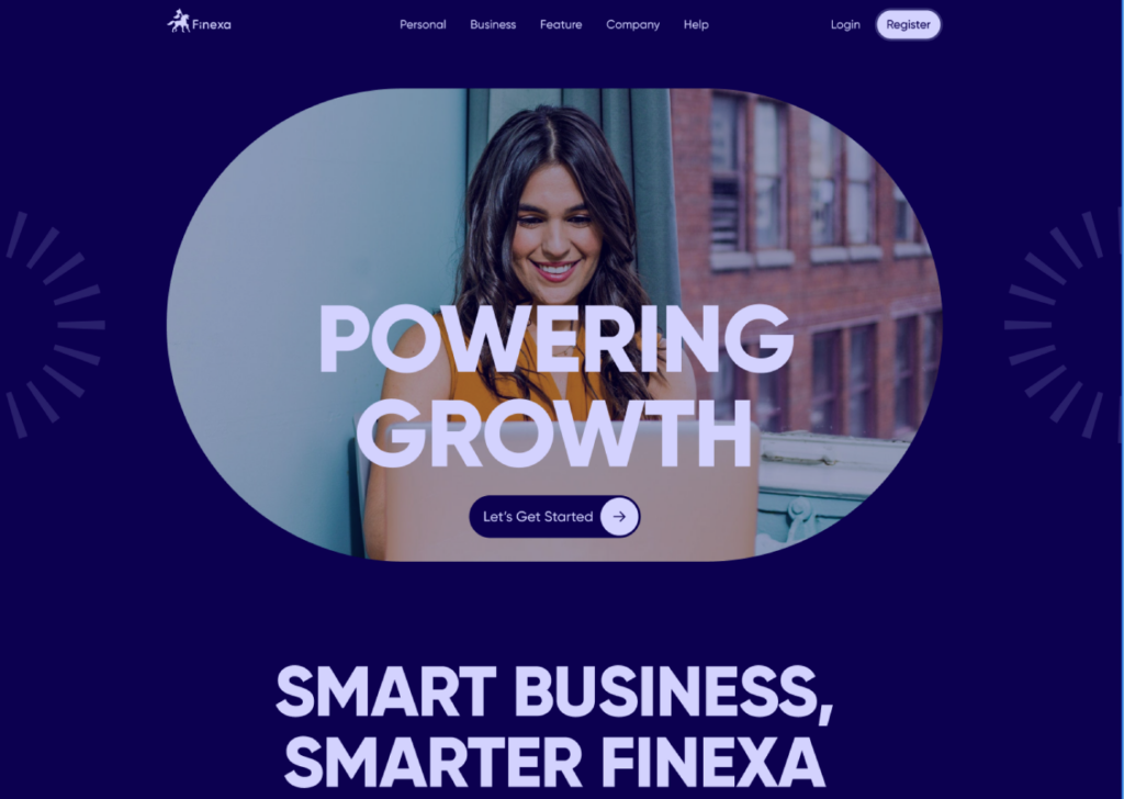
Here is Finexa’s business page design with an enticing hero section and a display of Finexa’s customized features. On the right, there’s a comprehensive Q&A section with an accordion design for an optimized experience on any screen size. The business page design uncovers color spaces that feel vibrant and professional, just like the unpredictable working spaces.
Is a Custom Design Worth It?
Speaking for our projects, the use of custom designs has led to a substantial increase in organic traffic and a boost in average session duration within three months. When done correctly, custom designs can create a platform that reflects your brand, earns user trust, and evolves with your business. As Abron Studio, we believe nothing can outperform the effect of a custom UI/UX, which brings you a unique presence.
If you are looking to switch from your past online appearance to embracing your brand identity, we can help you. Book a Free Consultation at [email protected].
For more articles, visit our blog. Follow Abron Studio on LinkedIn
