Isn’t life passing by in a blink of an eye? When you look back at the days you were causelessly happy, you may remember how a piece of chocolate would make your day. All you needed was a toy to play and you had nothing to worry about. Setting off from this point, we received a project reminiscent of our carefree joyful days. We wanted to use our magic touch to visualize the world of children. Like playing with dough, we had to mold the UI into an amazing imaginary universe. But how could we design the UI/UX of a toy company that produces slime and play dough? Let’s dive into how we utilized the brand products in its UI/UX design and see the final results!
Project Scope:
- UI/UX design
- Responsive design
- 3D character design
- Motion graphics
Project Brief:
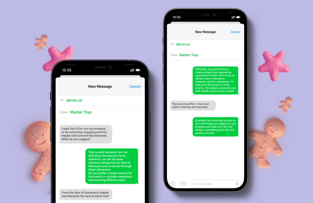
This project targets kids between two and ten years old. Master Toys is a vendor to toy giants Hasbro and Mattel, specializing in play doughs, slimes, and plastic toy sets. During our first meeting with our client, Cathine Chan, we envisioned a dreamy UI that appeals to our young and playful target audience. With this in mind, we decided that character and motion design were paramount to achieving the intended UI.
Project Goal:
The underlying goal behind a UI/UX design for Master Toys was to familiarize digital natives with the brand and allow them to download its brochures and check out their products.
Process:
We initiated the design process for Master Toys with an understanding of what the client demands and what we believe can benefit the brand. Through long discussion sessions, we determined our problem, shaped user personas and highlighted necessary UI features to develop the most utilitarian solution.
UX Research:
We used user research methods such as surveys with parents, interviews with children, and direct observation during play sessions. These insights revealed key preferences and behaviors, such as favorite colors, characters, and interaction styles, which significantly informed our design decisions.
Designed Elements
3D Characters
Like every design project, we carefully explored competitors in Hong Kong to come up with an initial idea of what to do to stay on top. What we found is that many competitor UIs featured images of cheerful kids playing with the product.
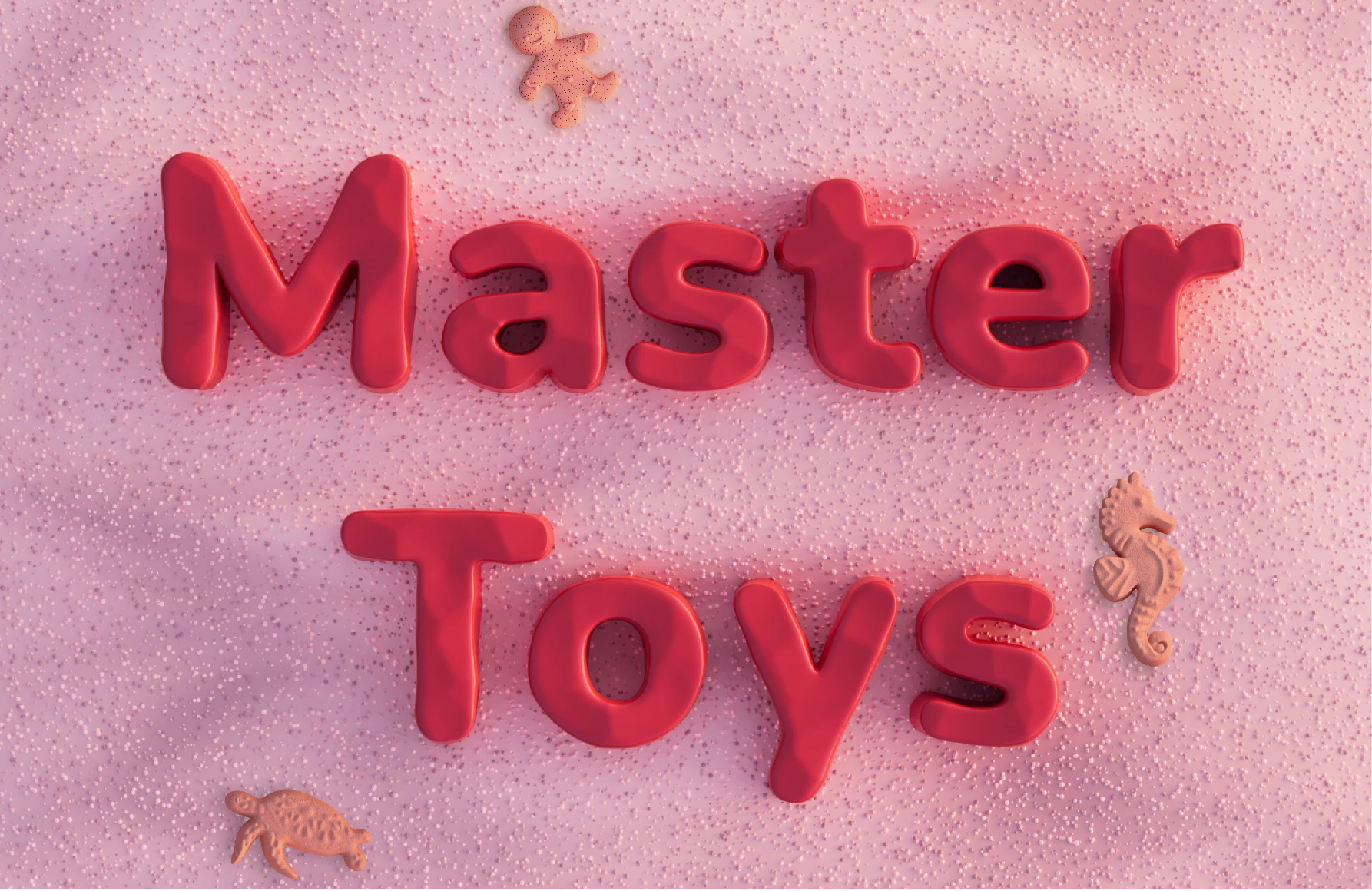
Master Toys was itself a charming brand identity, whispering the joy and wonder found in playing games. To make it stand apart, we agreed to expand Master Toys’ branding with a 3D character design.
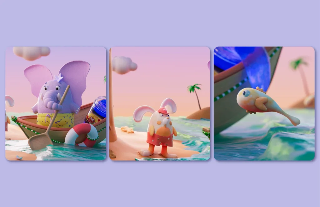
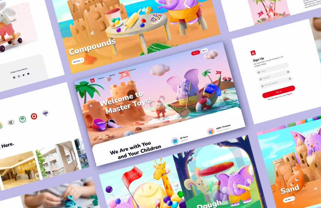
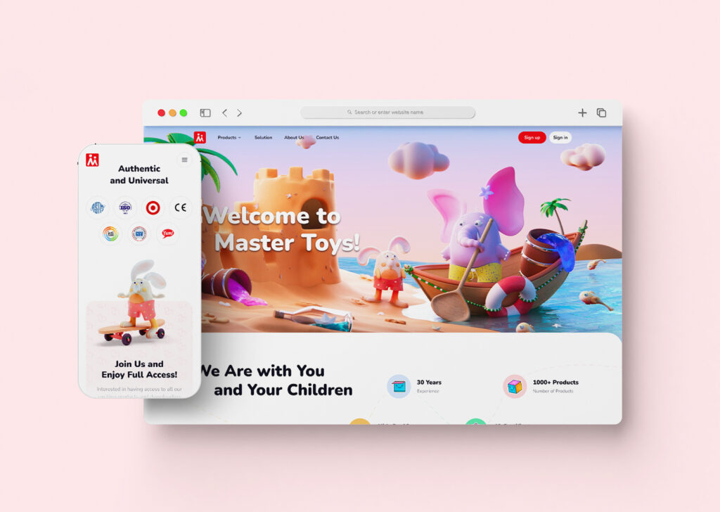
A touch of magic reshaped our wireframes into an immersive story solidified by character development in an on-brand setting. The characters would become mascots for Master Toys, adding a bit of story and fun to its brand identity. Our primary characters were on a voyage of exploration on the charming Master Toys Island, made of brand products. We used these characters for the hero section, to not only spark children’s curiosity but also represent five product categories artistically sewn on to this Island.
Ms. Elephant
Ms. Elephant is a purple, cute character rowing through the slimy sea with its curly nose. We chose an elephant because it’s known for rolling around in the mud, making it a playful animal that children love.
Mr. Rabbit
Mr. Rabbit is a hyperactive and sportive rabbit hopping up and down with its on-brand cap. A rabbit is chosen to accompany Ms. Elephant due to the childhood memories it evokes, as almost everyone has had a rabbit toy to cherish in their childhood.
Flying Fish
Two small orange and white fish fly through the slimy sea, adding a lot more visual interest to the hero section.
Color palette
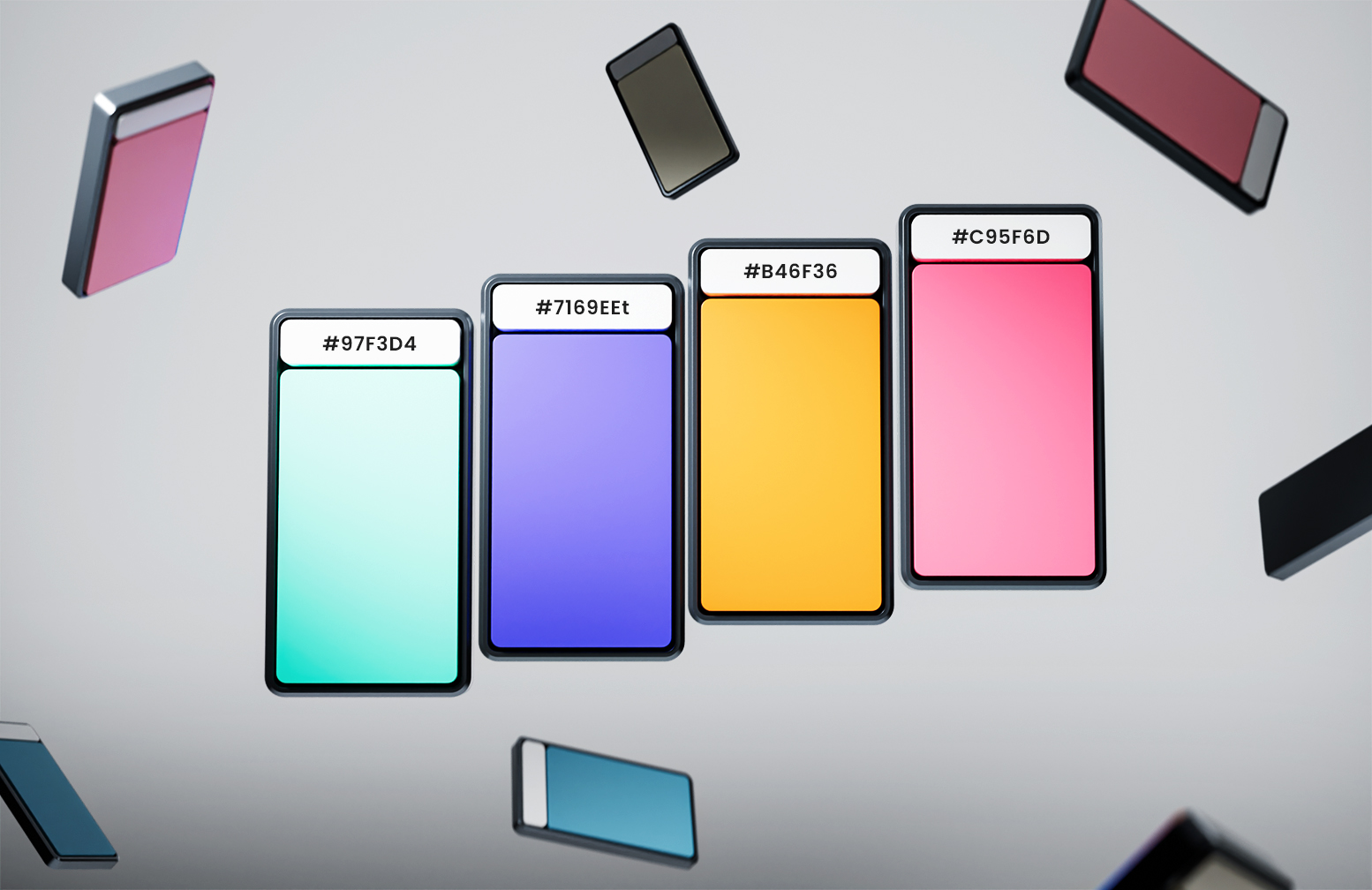
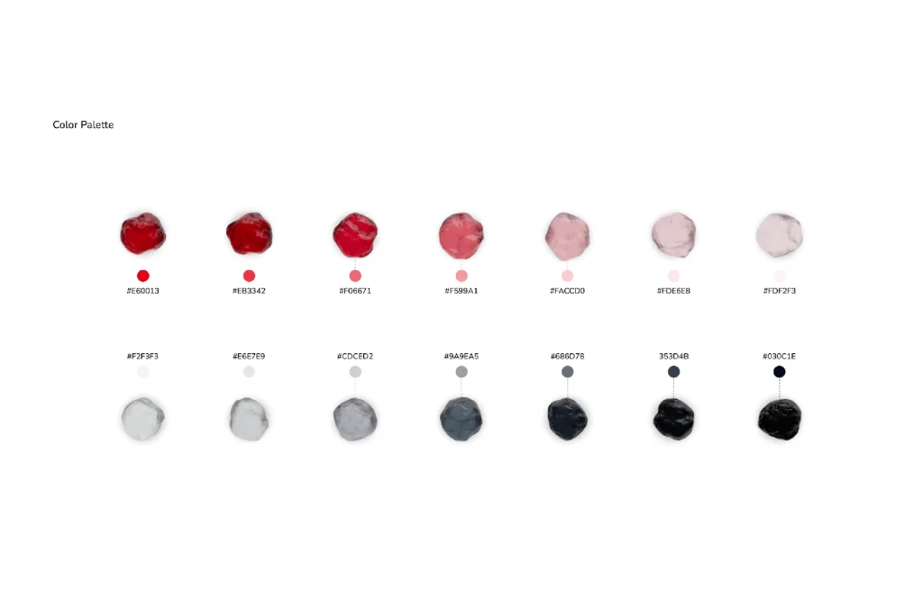
We curated a color palette full of vibrant colors characteristic of our design target. Red was already chosen for the brand’s logo, and we added accompanying colors Fulvous, Tang blue, Emerald and two neutral colors—rich black and white. The colors ensure a dynamic, exciting, and uplifting UI we were aiming to create.
Typeface
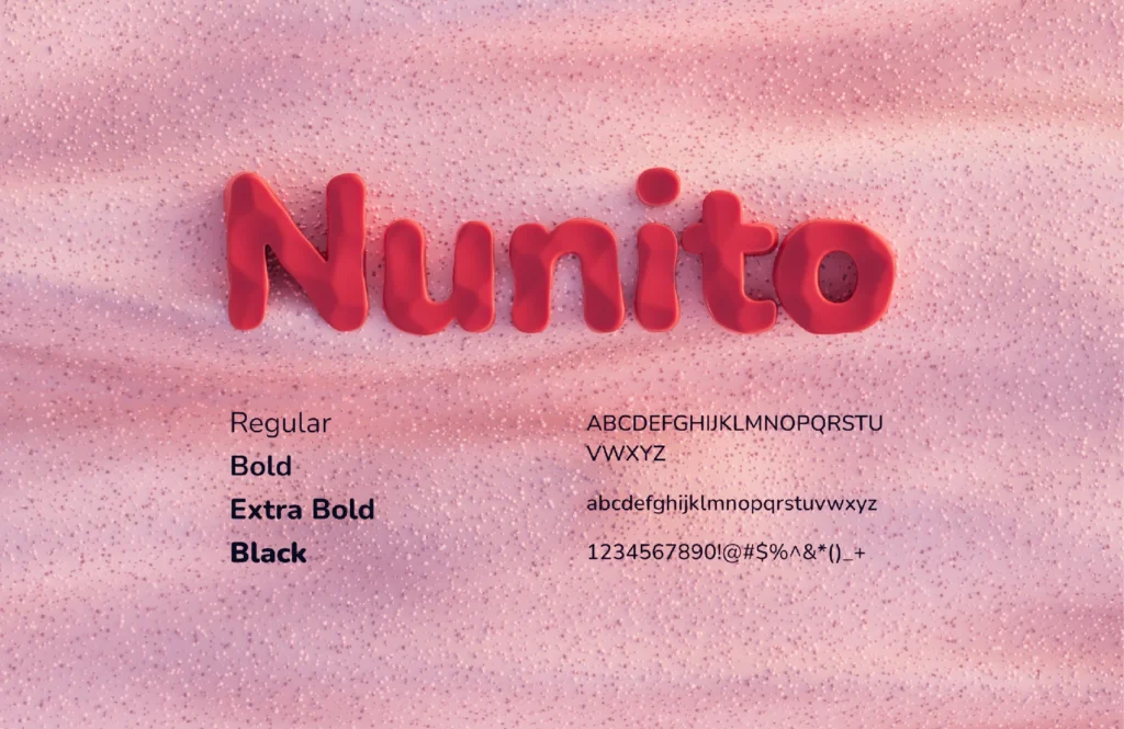
A sans-serif typeface was used to convey friendliness with its soft and round edges, making it an engaging choice that is easy to read.
3D Graphics and Motion
With our technical prowess in motion design, the hero section upgrades from a still image into an interactive digital experience that captivates children.
UI/UX
Our main intention was to design a UI/UX that would make users feel like they are flipping through the pages of a story book. We initiated with low-fidelity wireframes and added our illustrations to the high-fidelity versions. We emphasized texture in 3D design in an attempt to represent animals made of dough with realistic imperfections. The island visualized realistic sand meeting the slimy sea and under the shadow of foamy trees.
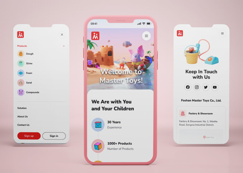
The most challenging part was to strike a balance between usability and aesthetics. Early versions of the UI were visually appealing but lacked intuitive navigation for young users. Through multiple iterations, we streamlined the interface to ensure it was both engaging and easy to use.
Testing
We conducted a test to ensure the effectiveness of our illustrations, particularly the characters. Given that interaction with children was the most challenging part of the design process, we showed the illustrations to a group of kids between 2 to 10 years old. Smiles appeared on the faces of all participants when they saw the hero section. They were curious about the illustrations and passionate about playing with them. This experiment confirmed the quality of our design and its positive impact on Master Toys as a brand.

Final Results
This project allowed us to revisit our childhood, taking into account what kept us engaged and passionate. This project took a lot of effort, done with a strong commitment from our illustrators, 3D, UI/UX, and motion designers. The result was a juicy cute UI animated to interact with children.
Check out our Dribbble for more projects.
