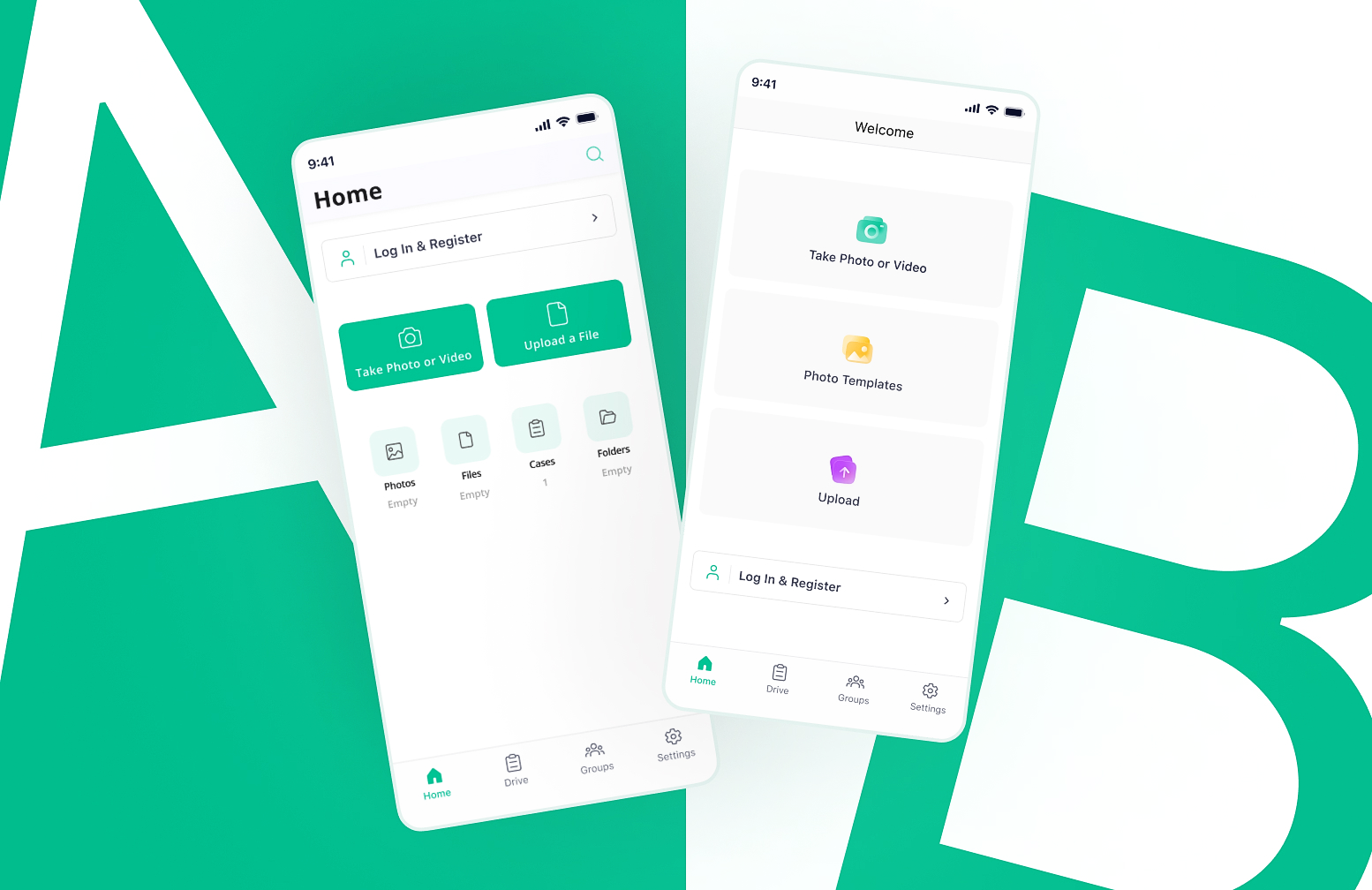
UI design can be a challenging task since there are various aspects to consider, including layout, typography, and color. While all of these elements are essential, color selection is one of the most important aspects of UI design that takes significant time and consideration. Color has the power to evoke emotions, influence behavior, and represent a brand’s identity, which compels us to further explore the significance of color selection in UI design.
How to select a color for your UI?
There are some factors that you need to take into consideration when coming up with a color palette for your design:
Color Psychology
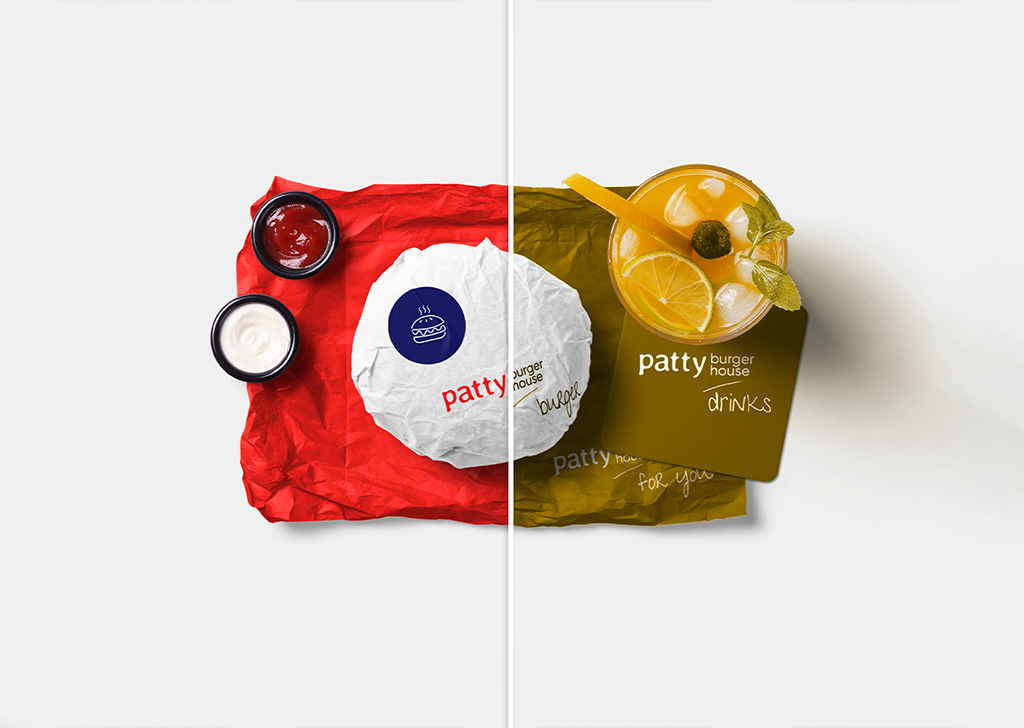
Color has a profound psychological impact on individuals. Each color evokes a different emotion and influences user behavior on a subconscious level. For instance, blue is often associated with trust, reliability, and security. It’s no surprise that many financial institutions use blue in their branding and UI design. Similarly, red is associated with excitement, energy, and urgency. Food delivery apps and e-commerce sites often use red to create a sense of urgency and encourage users to make a purchase.
Cultural Differences
In addition, cultural differences can affect the way users perceive color. For example, in Western cultures, white is associated with purity and cleanliness, while in some Eastern cultures, it can be associated with loss and mourning. Similarly, in some cultures, yellow is associated with joy and happiness, while in others, it can signify cowardice or caution. Designers must consider these cultural nuances and ensure that their color choices suit their target audience.
Color Relativity
Color relativity is the idea that the perception of color is relative to the colors around it and the light that shines on it. When a color is placed beside a different color, it may appear brighter or duller than it would if it were viewed on its own. For example, a bright yellow might be perceived as cheerful in one context, but overwhelming and jarring in another.
The Importance of Color Accessibility in UI Design
Colorblind Users
Accessibility is a critical consideration in UI design. Color accessibility is particularly important because it ensures that users with visual impairments or color blindness can still use the interface effectively. About 8% of all men and 0.5% of all women are red-green color blind. Designers can use tools such as Colorblindly to ensure the visibility of their interface to colorblind users.
Colorblindly is an efficient google chrome extension that helps UI designers simulate the experience of colorblind users on their website and design their interface accordingly.
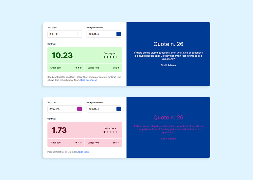
Contrast Guidelines
Designers must ensure that there is enough contrast between the background and foreground colors to make the text legible. Based on Web Content Accessibility Guideline (WCAG), not only the text font must be above a certain range based on the screen size, but the contrast between the text and background in terms of color should have a minimum ratio of 4.5:1 for large text and 7:1 for normal text. Colors.co is a great website for checking the contrast against the background color.
In addition, designers can consider providing alternative color schemes or providing users with the option to customize color settings. This approach can help accommodate users with different visual needs and preferences.
Color Meanings
Each color can be associated with different feelings and meanings. Even though color perceptions can vary across different cultures and contexts, there are common symbolizations that each of the primary colors is associated with:
Red
The color red is often associated with energy, passion, and excitement. It can also symbolize love, anger, and danger. Red is often used to draw attention and evoke strong emotions. It is also frequently used to warn and signal caution and danger.
Green
The color green is often associated with growth, nature, and renewal. It can also symbolize positive action and success. Green is often used to create a sense of achievement. In some cultures, green is also associated with health and healing.
Blue
The color blue is often associated with calmness, relaxation, and trust. It can also symbolize loyalty, wisdom, and neutral information. Blue is the most popular color in the world, which may explain why so many businesses use blue tones in their branding.
Orange
The color orange is often associated with enthusiasm and optimism. It can also symbolize a warning in UI design. Orange is frequently used to convey spontaneity and positivity in life, as well as to inquire if the user is sure of the action he/she has taken.
Yellow
The color yellow is often associated with happiness, optimism, and youth. It can also symbolize cowardice and caution. In the interface, yellow can be used to attract attention to an urgent message, add joyfulness or symbolize wealth and luxury.

Brown
The color brown is a warm, natural color that evokes a sense of strength, reliability, and dependability. It is often associated with earth, wood, stone, and other natural materials. Brown can also represent coziness and security. It is the color of stability, structure, and support. And, of course, it can be affiliated with being dirty or dingy.

Gray
The color gray is an achromatic color that is often associated with neutrality, balance, and calmness. It is sometimes used to represent a modern, minimalistic, and timeless design. Gray is often seen as a versatile and neutral color that can be used to create a range of moods, from cool and sophisticated to dull and sad.

White
It is a color characterized by its brightness and neutrality. It is the color of purity and is often associated with cleanliness and innocence. White can be used to create a feeling of openness and spaciousness. It is an important color in many cultures, often representing peace and new beginnings.

Black
Black is a color with a lot of depth and complexity. It is a powerful and mysterious color that can represent both good and bad. Black can be associated with power, luxury, and prestige. It can also represent darkness, death, and the unknown. Depending on the other UI colors being used alongside black, it can feel modern or traditional, formal or casual.

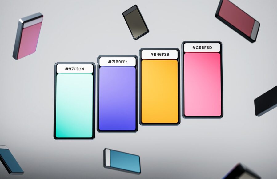
Color Proportions
The proper color proportion in UI design depends on the context and the desired aesthetic. Generally, a good rule of thumb is to use two main colors, plus an accent color to add contrast. Additionally, it is important to consider different shades and tones of the main colors to create a sense of depth and visual hierarchy.
Pick a primary color displayed most frequently across your product. You need maximum1-2 primary colors. If you have a very saturated color like orange, it should be combined with a naturally neutral one.
Golden ratio: 6:3:1 Rule
60% dominant color used for backgrounds
30% secondary color used for typography and other graphic elements
10% accent color used for the most important elements of the design where we want to grab user attention
Typical Mistakes in Color Selection
Over-complicating the design: Too many colors can make a design appear cluttered. It is important to focus on a few main colors and stick with them throughout the design.
Colored backgrounds: Colored backgrounds can be distracting and make it difficult to focus on the important elements of a user interface. They can also clash with text and other design elements, thus making the interface difficult to use. Additionally, colored backgrounds can make it harder to read text, as some colors can be difficult to read on certain backgrounds.
Relying solely on color: Designers should also avoid using color as the only means of conveying information. For instance, if an error message is highlighted in red, there should also be an accompanying text explaining the error.
Final Thoughts
It’s important to note that color selection is not an exact science. It requires careful consideration, research, and testing to ensure that the colors chosen are appropriate and effective for the intended audience. As such, designers should be open to feedback and willing to make adjustments to their color choices based on user feedback and testing results.